Case study
Project Overview
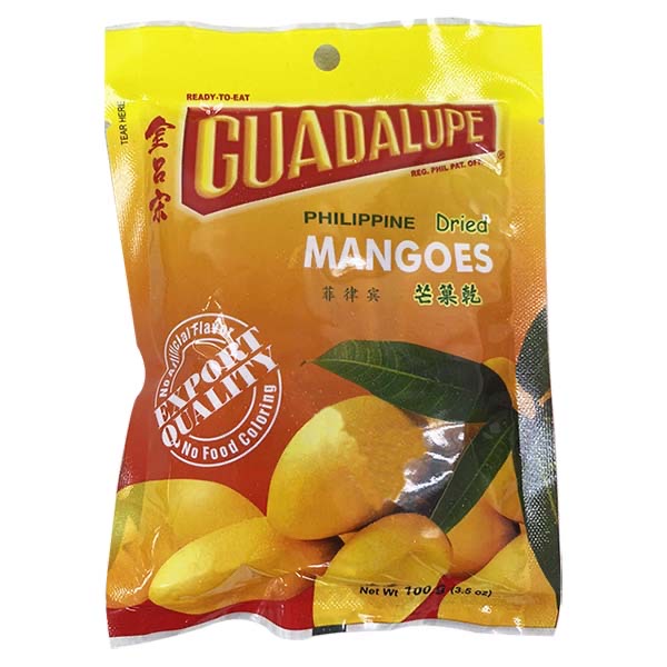
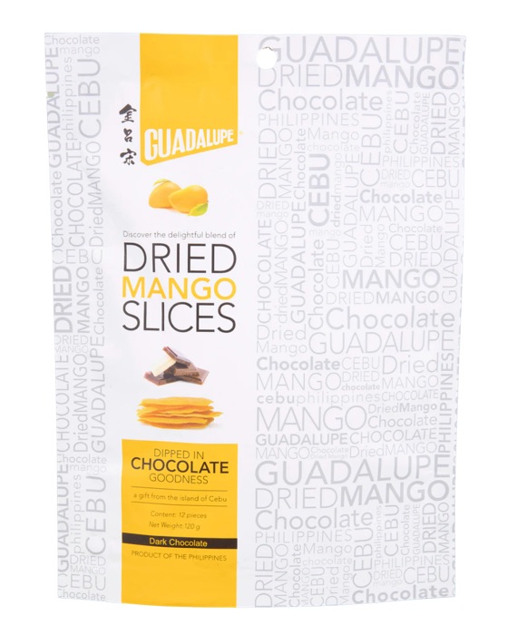
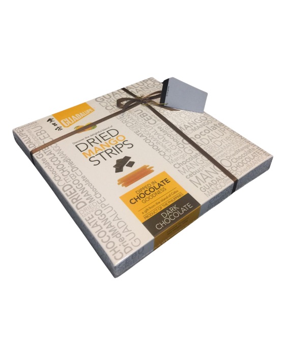
Guadalupe is a heritage-driven dried mango brand deeply rooted in Cebu’s rich agricultural tradition. Established in 1973 as a family-owned business, Guadalupe has upheld its commitment to quality, artisanal craftsmanship, and natural ingredients, setting itself apart from competitors through its dedication to premium, handpicked mangoes with no artificial coloring or additives. As the dried mango industry grows more competitive, there is an urgent need to strengthen Guadalupe’s presence by refining its brand image, ensuring it reflects the values of quality, consistency, and craftsmanship that define its products.
This project aims to develop a distinct visual identity that honors Guadalupe’s heritage while positioning it for future growth. The design direction will strike a balance between tradition and modernity, ensuring that Guadalupe is not only recognized as a premium local brand but also as a globally competitive name in the dried mango industry. By crafting a compelling and cohesive visual system—spanning logo, typography, and brand visuals—this initiative will lay the foundation for Guadalupe’s digital and retail presence, reinforce brand recall, and appeal to both existing loyal customers and new audiences worldwide.
Cultural Insight
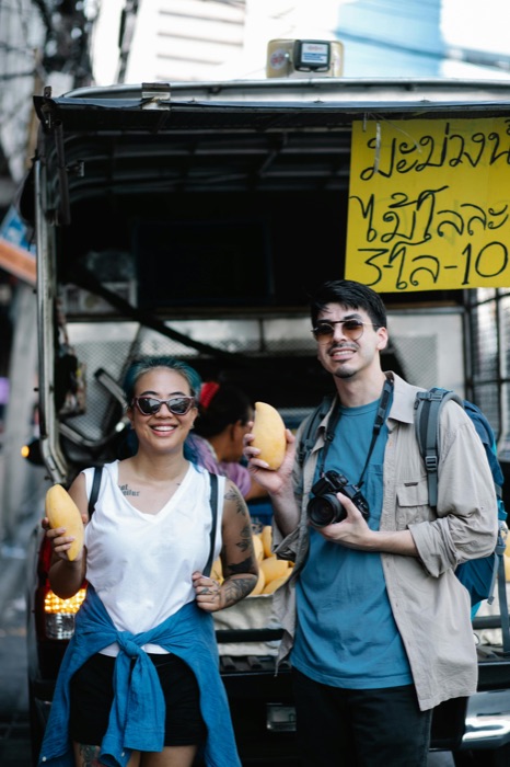
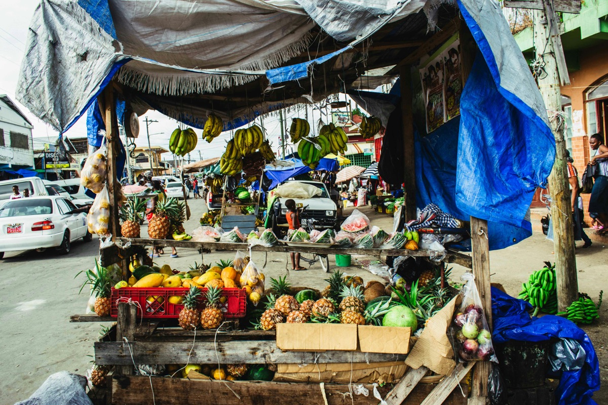
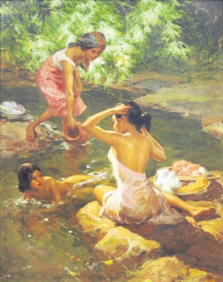
In Filipino culture, food is a cherished expression of hospitality, heritage, and connection, making dried mangoes a popular gift among locals and Overseas Filipino Workers (OFWs) who seek a taste of home. As consumer preferences evolve, there is a growing demand for brands that uphold tradition while embracing modernity, prioritizing quality, authenticity, and sustainability.
Social media has amplified the importance of visually compelling and well-branded products, pushing local brands to elevate their identity to compete on a global scale. This shift presents an opportunity for Guadalupe to refine its visual identity, striking a balance between its artisanal legacy and a premium, contemporary appeal that resonates with both loyal and new audiences.
Core Values
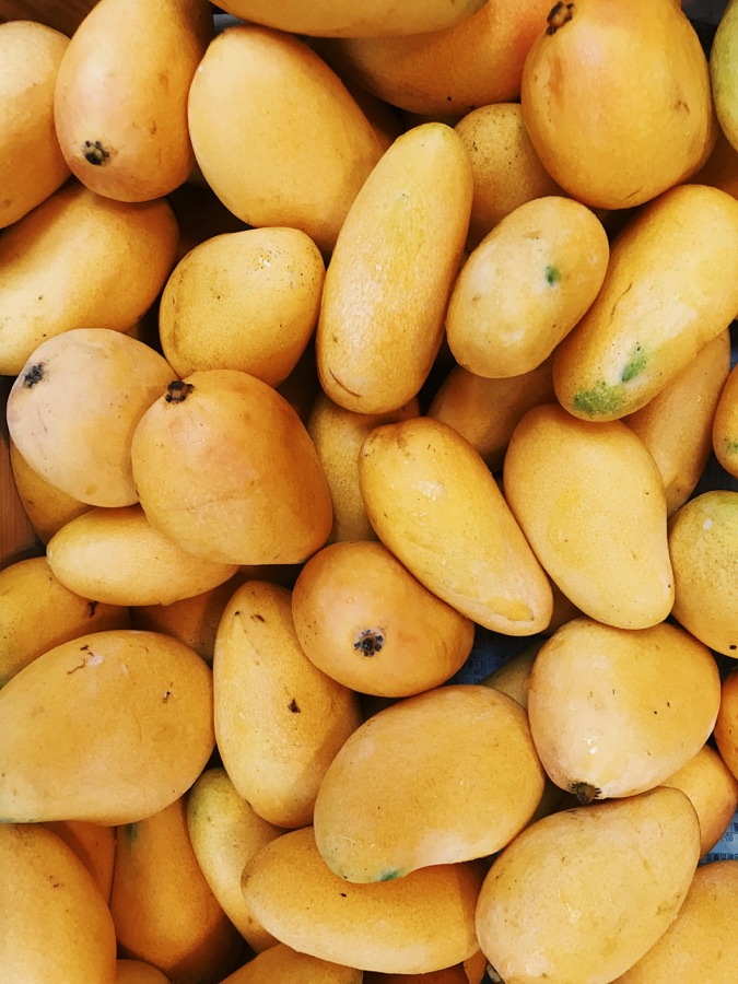
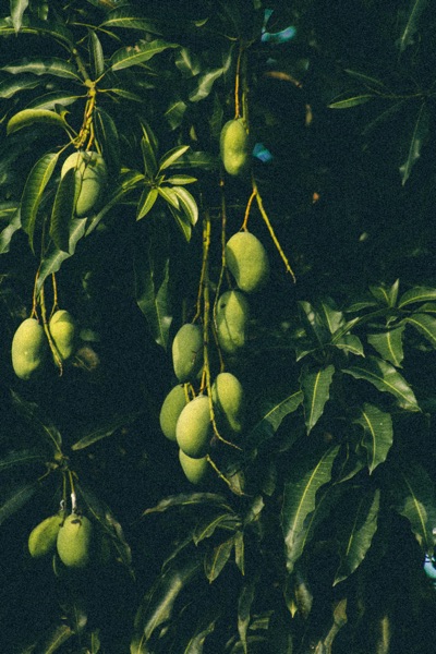
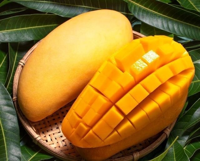
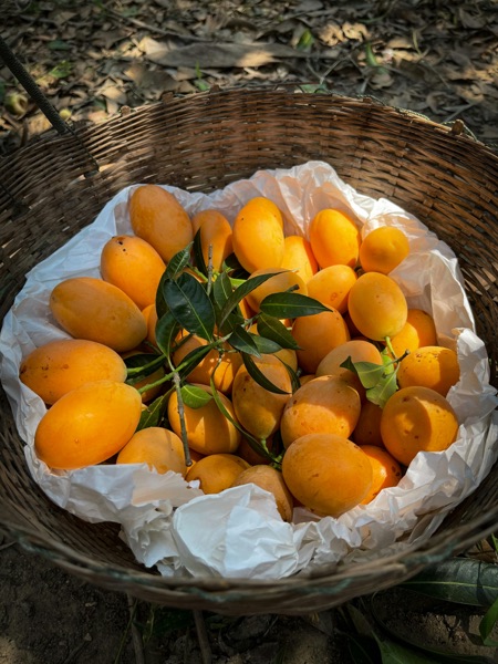
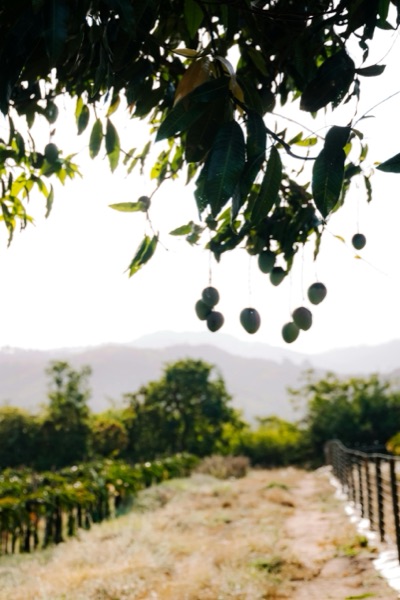
Rooted in a legacy of craftsmanship and quality, Guadalupe’s brand identity is built on authenticity, consistency, and artisanal excellence. Every product reflects the brand’s commitment to using only handpicked, naturally ripened mangoes, ensuring superior taste without artificial additives.
Sustainability and ethical craftsmanship are at the heart of Guadalupe’s operations, valuing the people behind the process as much as the product itself. As the brand evolves, it embraces a refined yet heritage-driven identity, balancing tradition with innovation to create a premium, globally competitive dried mango brand that remains deeply connected to its Filipino roots.
Quality defines the brand’s identity and is the cornerstone of its reputation. By handpicking the finest mangoes and adhering to artisanal methods, Guadalupe Dried Mangoes ensures its products exceed customer expectations.
The brand’s roots in Cebu’s mango culture and its artisanal production methods set it apart from mass-produced competitors. This authenticity builds trust and emotional connection.
By providing livelihoods to local workers and adhering to sustainable practices, Guadalupe Dried Mangoes aligns its growth with the well-being of its community and the environment.
1Heritage in Every Bite
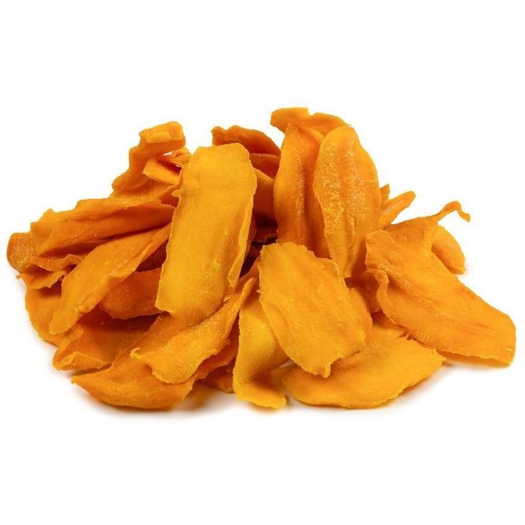
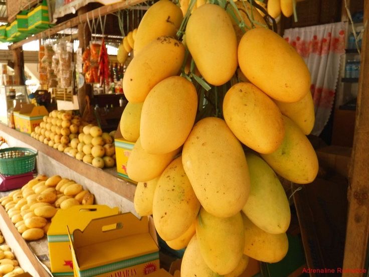
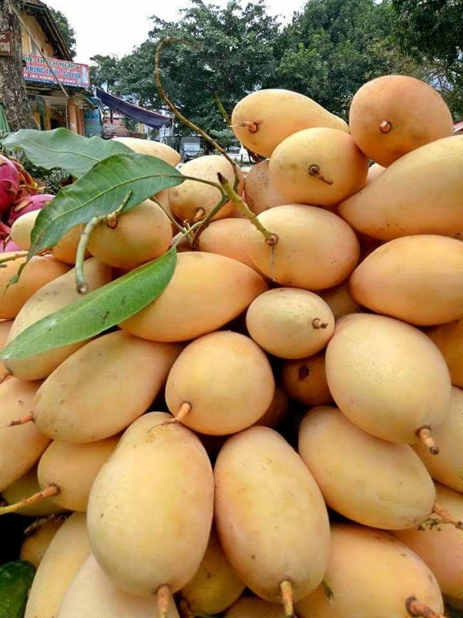
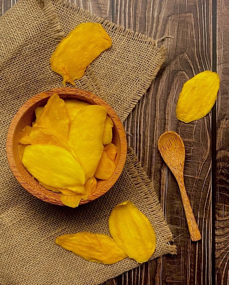
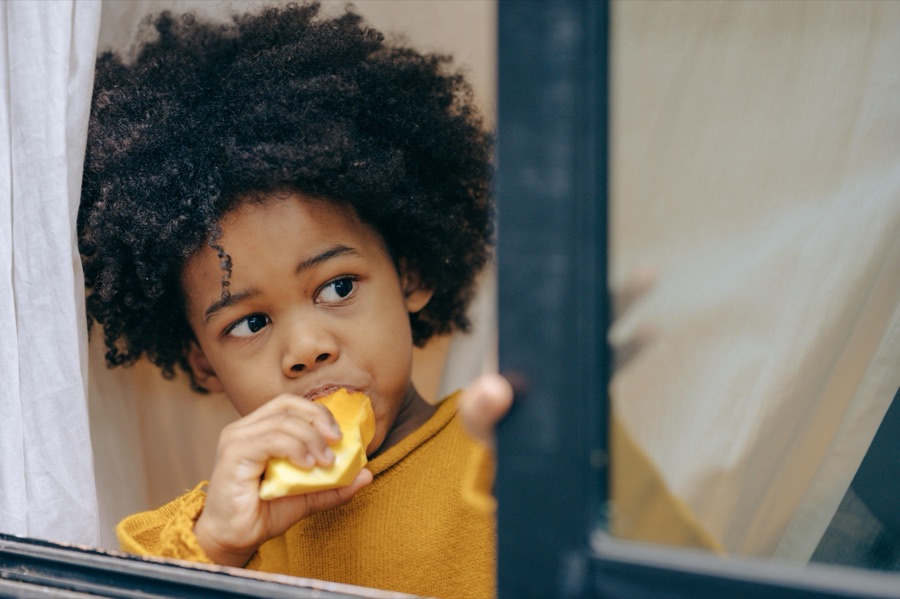
Each slice of Guadalupe dried mangoes carries the story of generations, handcrafted with care and tradition. More than just a snack, it is a connection to home, a taste of nostalgia, and a reminder of the rich, sun-kissed orchards of Cebu.
2A Taste of Togetherness
3The Scent of Tradition
The natural sweetness of handpicked, perfectly ripened mangoes fills the air with an aroma that evokes memories of family gatherings, sunlit afternoons, and the simple joy of indulging in something truly made with care.
4Crafted by Hand, Rooted in Legacy
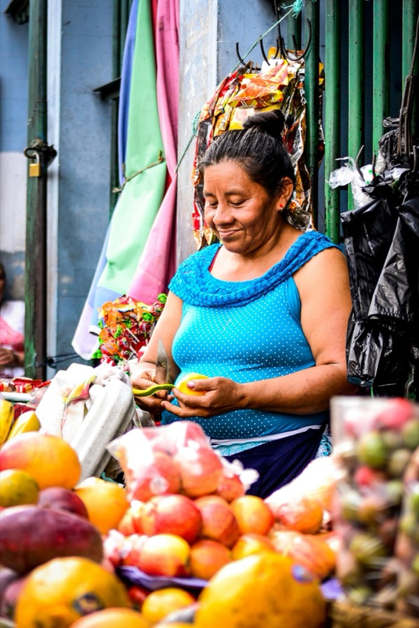
Every slice is peeled, cut, and dried by skilled hands, ensuring that the tradition of artisanal excellence is preserved. This meticulous process transforms nature’s bounty into something uniquely special—a premium dried mango experience unlike any other.
Brand Slogan
“Taste the Legacy, Share the Joy” encapsulates Guadalupe’s deep-rooted heritage and commitment to quality, celebrating the craftsmanship behind every handpicked, naturally ripened mango. This tagline reflects the brand’s legacy of artisanal excellence, passed down through generations, while emphasizing the joy of sharing a truly authentic Filipino delicacy.
Whether gifted to loved ones or enjoyed as a personal treat, Guadalupe dried mangoes carry the essence of tradition, connection, and the simple pleasure of savoring something made with care.
Brand Logo
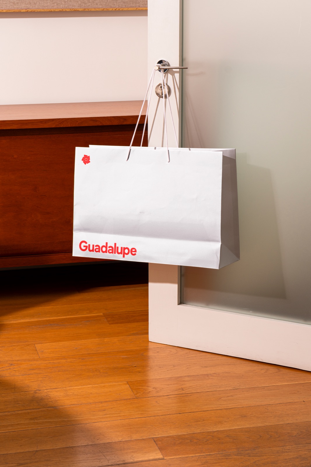
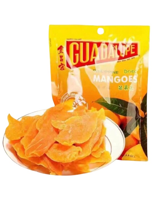
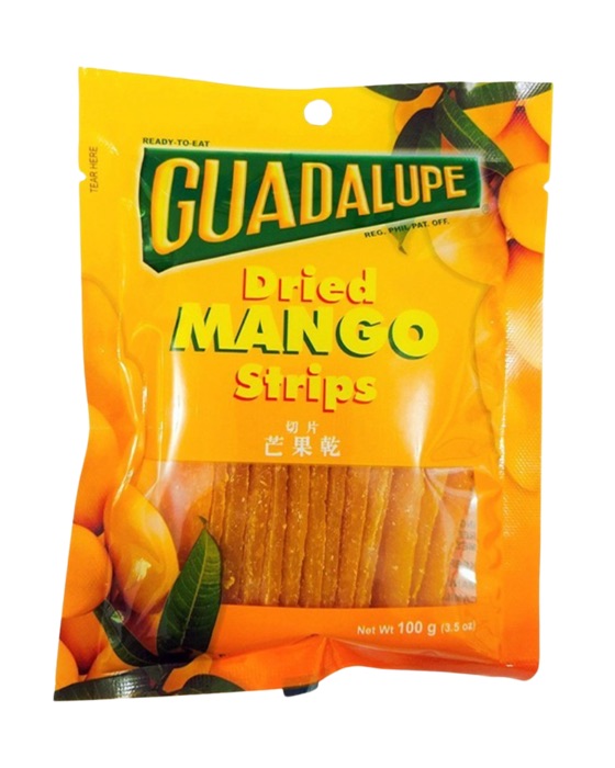
Guadalupe’s logo, designed with a clean and modern sans-serif font, ensures clarity and legibility across digital and physical touchpoints, making the brand easily recognizable in any setting. The softened, curved edges of each letter reflect the brand’s dual archetypes—the Creator, embodying craftsmanship and innovation, and the Caregiver, representing warmth and tradition.
This thoughtful design subtly mimics the organic, raw cuts of hand-prepared mangoes, reinforcing Guadalupe’s artisanal roots. The minimalist approach further symbolizes the brand’s commitment to pure, all-natural ingredients, free from artificial flavoring and coloring, highlighting its dedication to authenticity and quality.
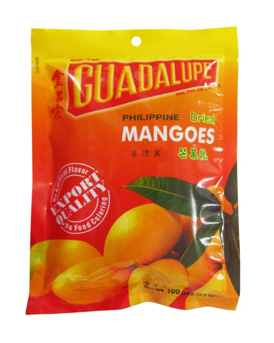
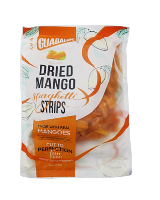
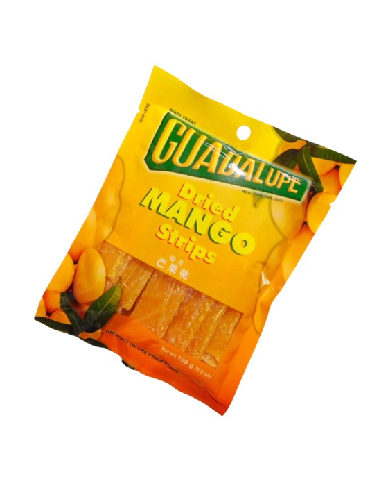
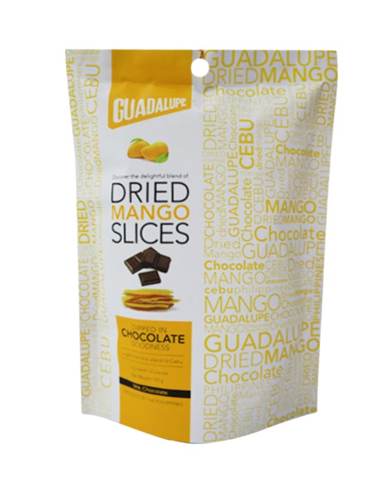
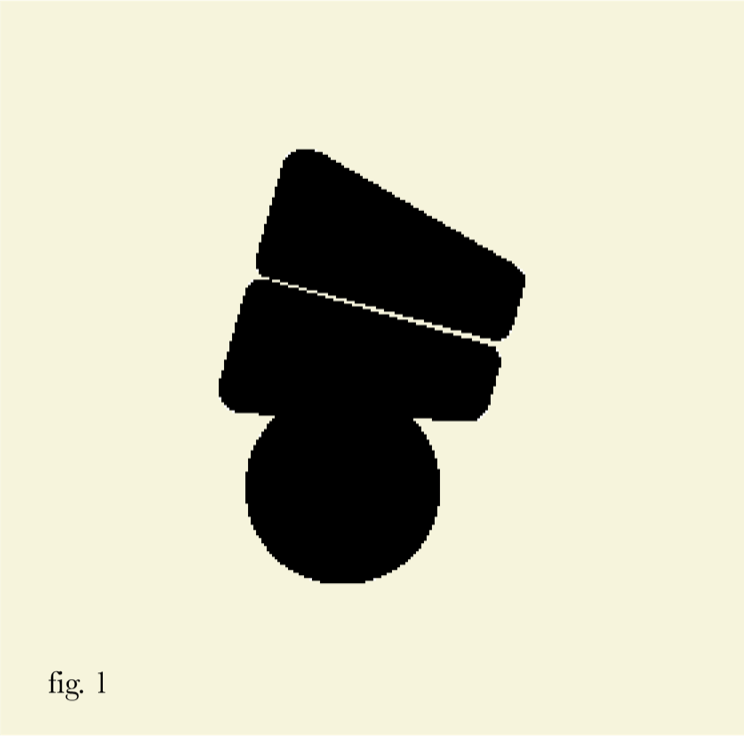
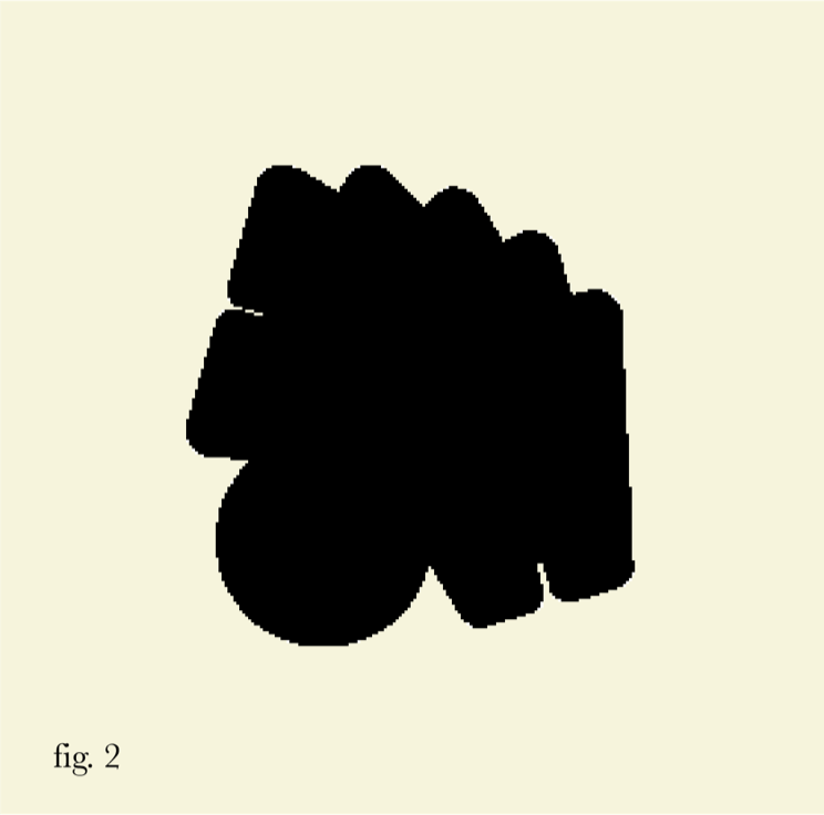
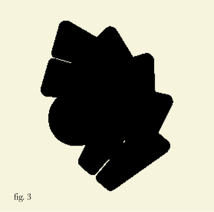
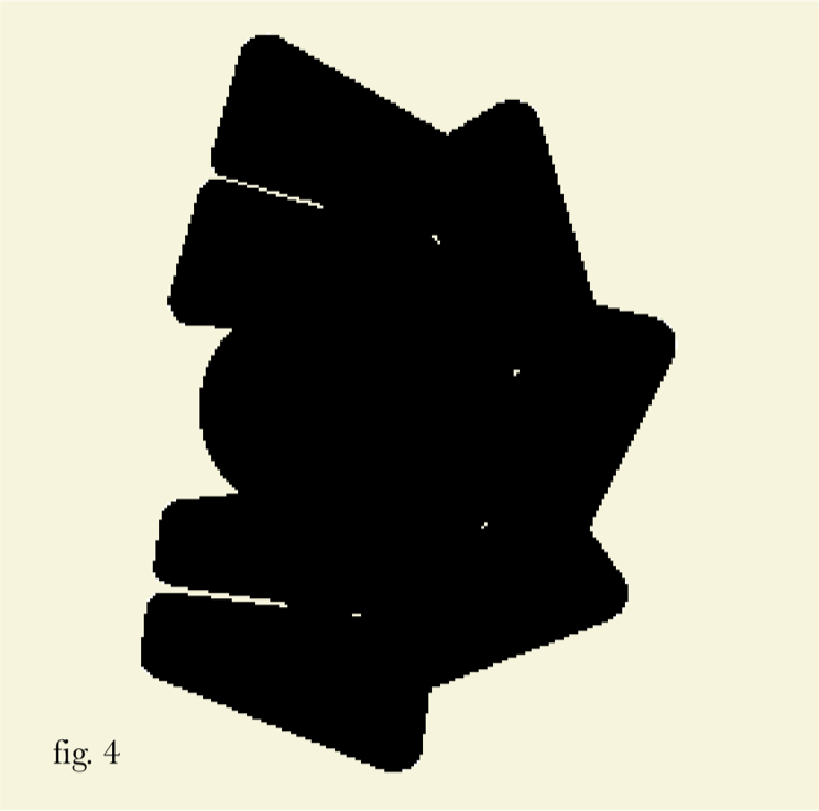
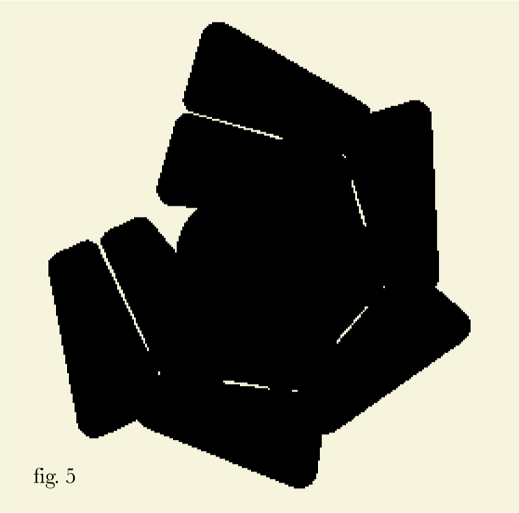
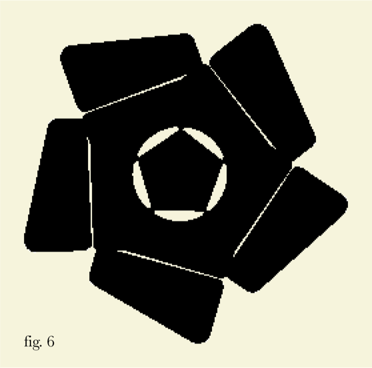
The Guadalupe logo has been refined to strike a harmonious balance between heritage, clarity, and modern appeal, ensuring it remains an effective visual identity across all touchpoints. While maintaining its minimalist foundation—which enhances legibility and adaptability in digital spaces—we have introduced trapezoidal elements as a subtle yet meaningful nod to Guadalupe’s previous visual identity.
These trapezoidal forms serve as a visual bridge between the past and the present, reinforcing brand recognition while aligning with the brand’s evolution. This refinement strengthens the visual cohesion between the logo and the broader identity system, allowing for a more distinctive presence while preserving its clean and versatile aesthetic. Through these updates, the Guadalupe logo remains a modern yet deeply rooted typeface, seamlessly supporting the brand’s storytelling and positioning in the market.
Trapezoidal Element


Background
Concept & Symbolism
Design Approach
Brand Strategy Alignment
quality without compromise


Brand Mark
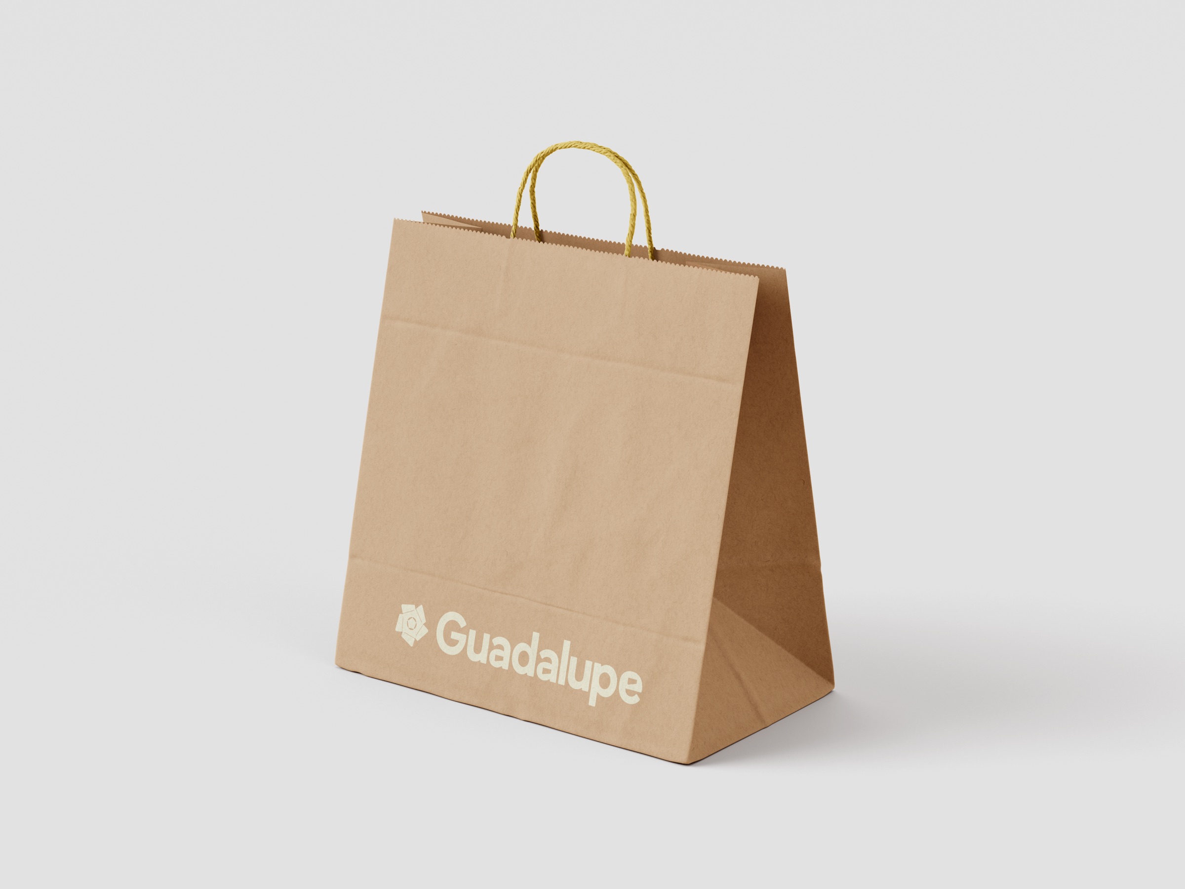
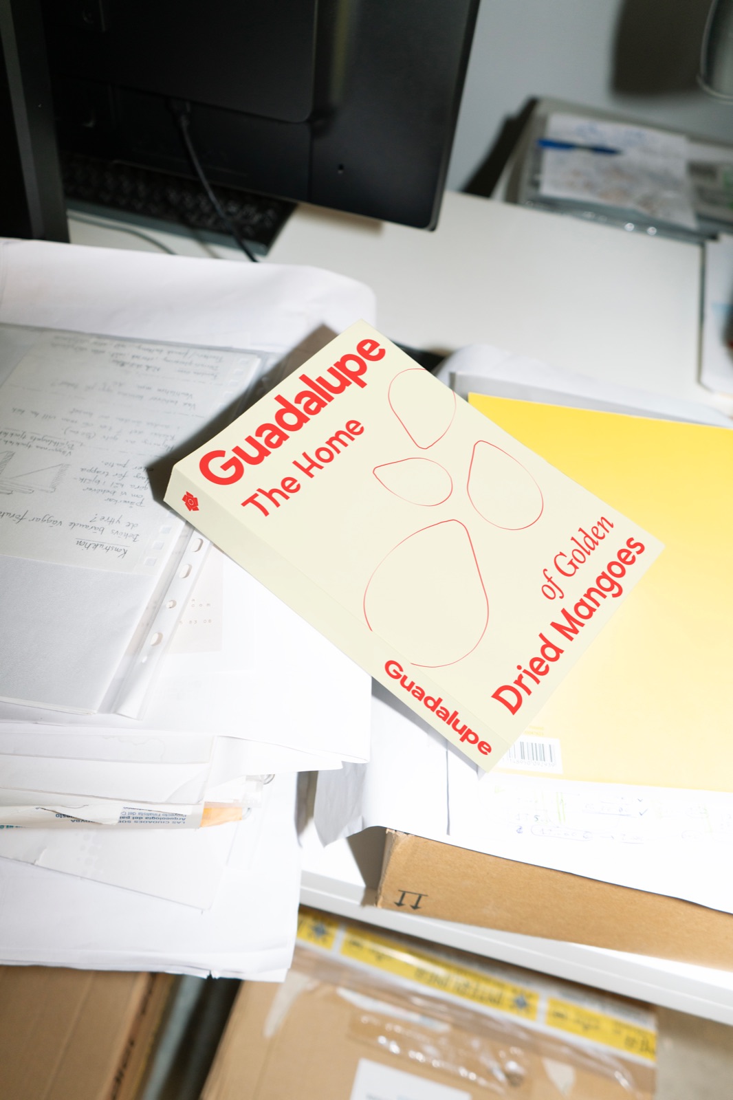
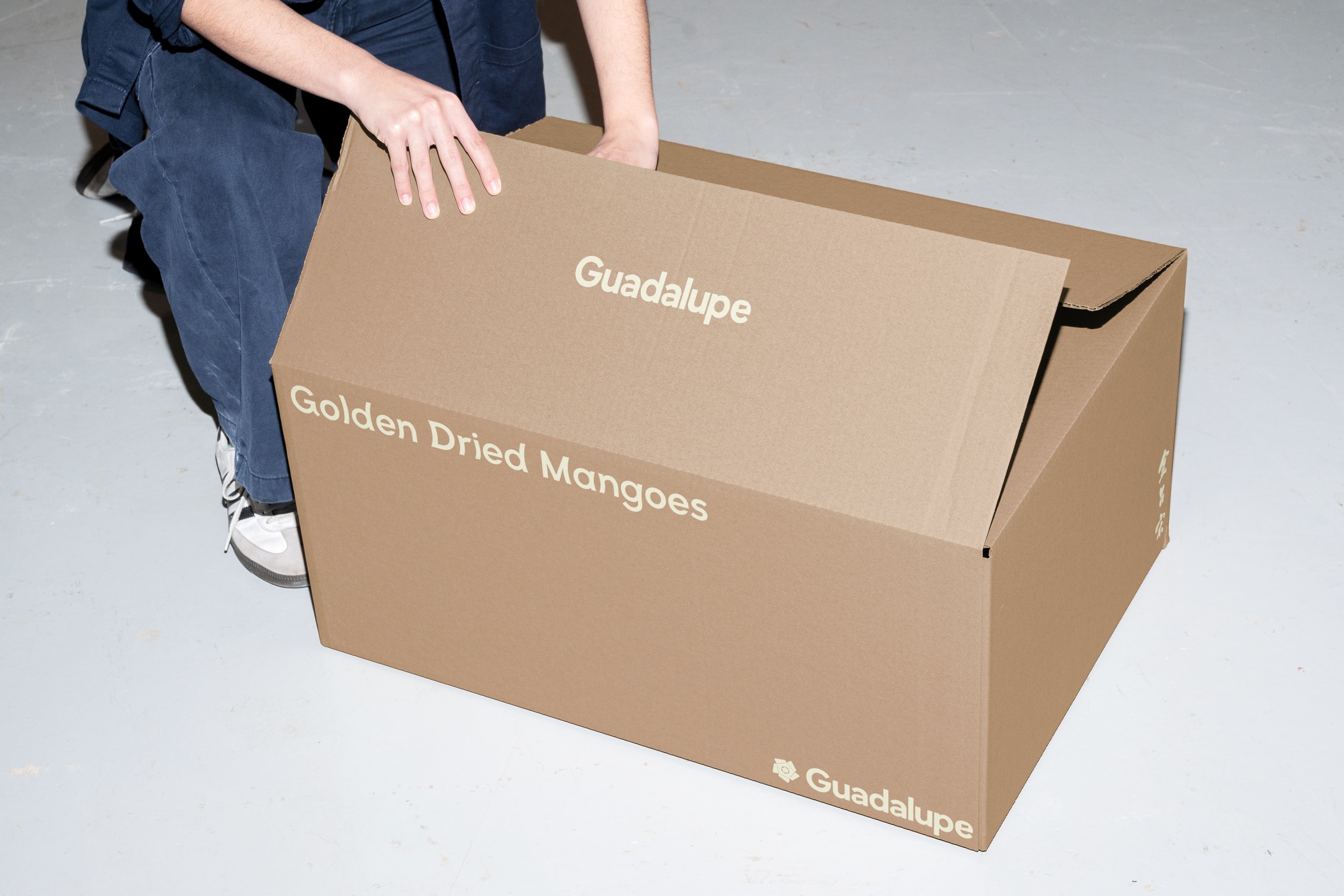
The Guadalupe brand mark serves as a visual anchor that seamlessly supports the logo while enhancing brand storytelling. Designed with a minimal yet meaningful approach, it prioritizes narrative clarity, ensuring that every element contributes to the brand’s overall identity. Its versatility allows for endless exploration across presentations, packaging, and digital applications, making it an invaluable asset in strengthening Guadalupe’s presence.
By maintaining a clean and cohesive aesthetic, the brand mark integrates effortlessly with the logo, creating a holistic visual system that reinforces brand recognition. This minimal framework also provides flexibility to explore different illustration styles for campaigns, adapting to various creative directions while maintaining consistency. Thoughtfully designed for both digital and print environments, the brand mark remains highly legible and recognizable, ensuring strong brand retention across all touchpoints.
Key Visuals
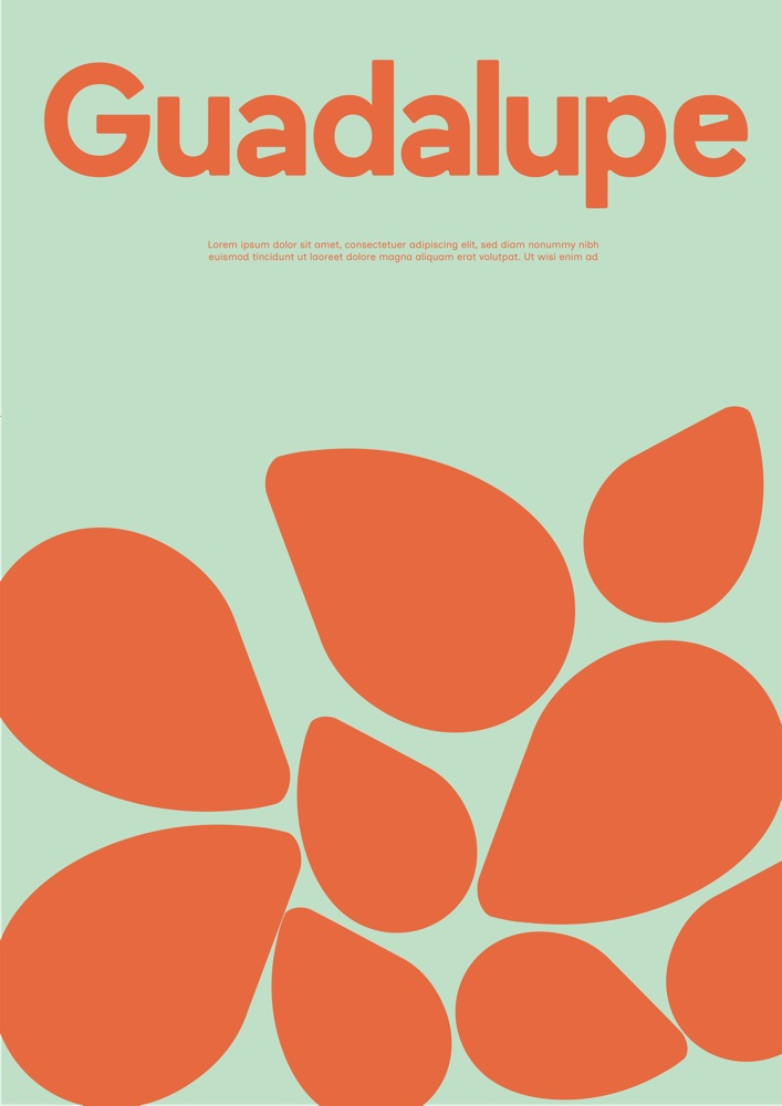
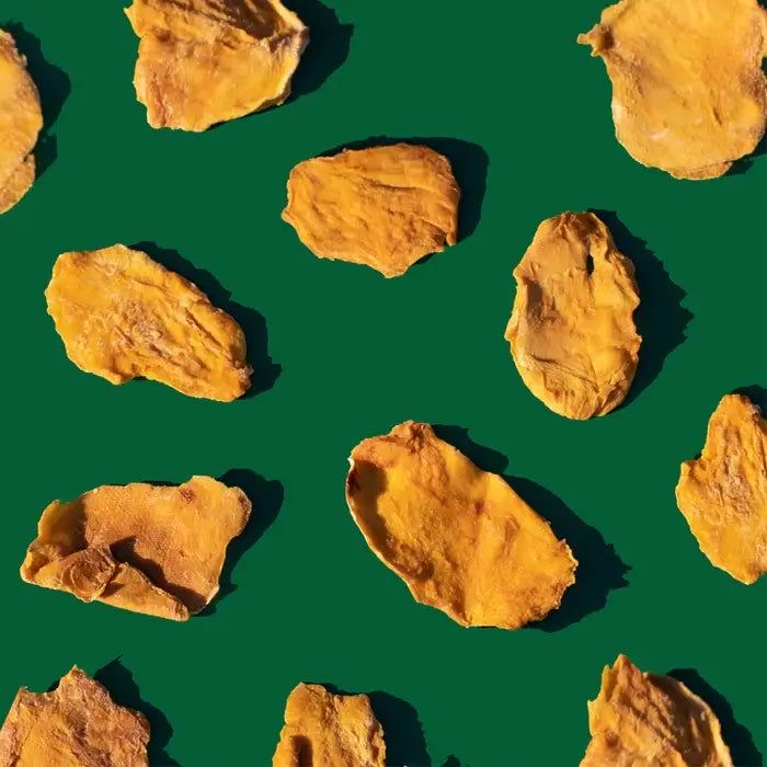
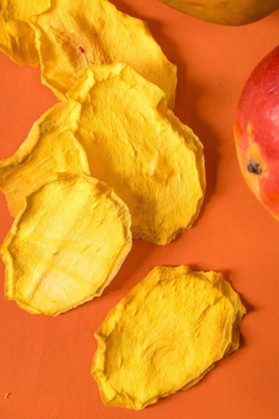
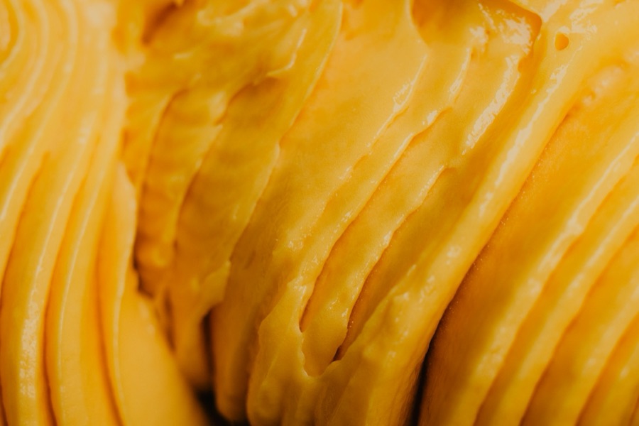
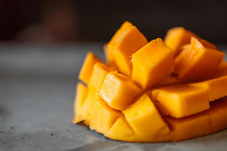
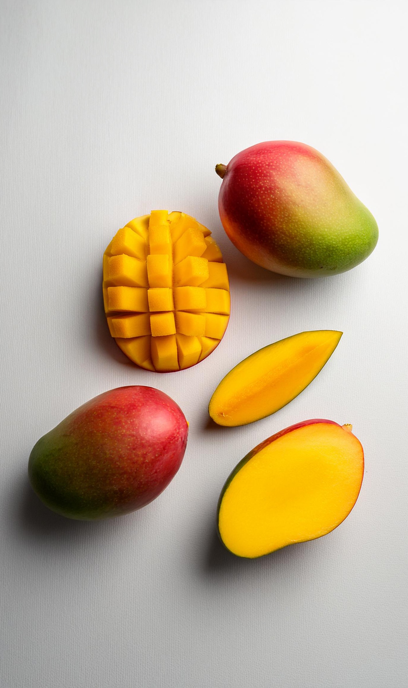
A key visual serves as a distinctive design element that instantly conveys the brand’s identity wherever it interacts with its audience. For Guadalupe, the key visuals are inspired by the products and the various ways a mango is consumed, creating a strong and intuitive connection to the brand’s food-centric nature.
Rather than relying solely on the logo and brand mark to signify that Guadalupe is a food brand, the key visuals take direct inspiration from the textures, forms, and cuts of mangoes, allowing for a more immersive and recognizable identity. These visuals are designed to evoke familiarity and appetite, reinforcing the artisanal and handcrafted nature of Guadalupe’s products.
Color and Typography
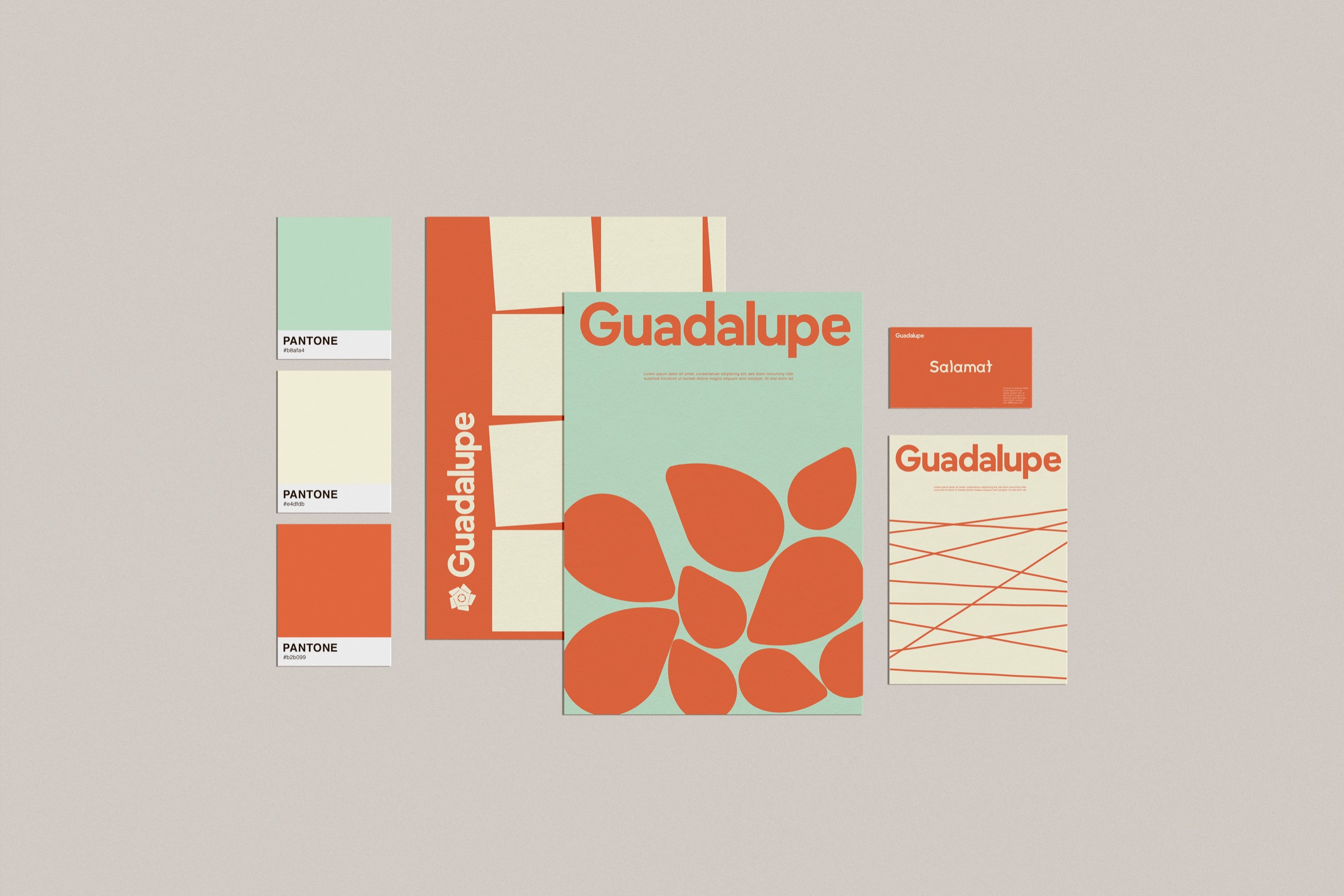
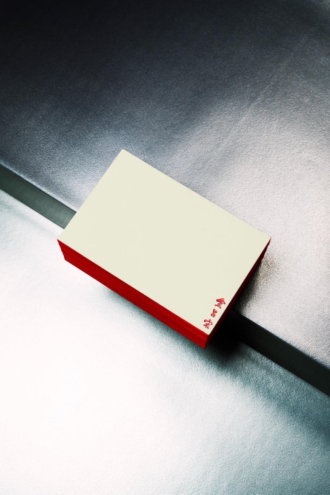
Guadalupe’s color palette is inspired by the vibrancy of Filipino heritage and the natural richness of its dried mangoes, creating a warm and inviting visual identity. The primary colors—red, orange, and yellow—capture the ripeness of mangoes, the warmth of the tropics, and the joy of sharing food. These hues reflect the bold, sun-kissed flavors that define the brand. Complementing them, light blue and beige provide balance, representing the freshness of open skies and the organic simplicity of Guadalupe’s handcrafted process. Together, these colors create a dynamic yet grounded visual system that resonates with both tradition and modern appeal.
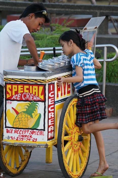
For typography, Guadalupe embraces Quiapo as its display typeface, a font inspired by the iconic jeepney signage of Quiapo, bringing a distinct Filipino character to the brand. This choice reinforces a sense of cultural authenticity, ensuring that Guadalupe feels deeply rooted in local artistry and tradition. For body text and content, Inclusive Sans is used for its modern, clean, and highly legible design, making it ideal for digital and print applications. This pairing strikes a balance between heritage and contemporary functionality, allowing the brand to feel both nostalgic and future-forward in its communication.
TASTE THE LEGACY, SHARE THE JOY
ABCDEFGHIJKLMNOP
QRSTUVWXYZ
abcdefghijklmnop
qrstuvwxyz
0123456789
!@#$%^&*()_+:<>
Thank
You