Case study
Lore Marketing
Brand direction
Lore Marketing’s visual identity is inspired by the timeless nature of knowledge, storytelling, and human connection. Rather than following contemporary trends commonly associated with marketing agencies, the identity draws from the visual language of books, manuscripts, editorial publishing, and handwritten correspondence. This reflects Lore Marketing’s belief that meaningful marketing is built on understanding people, communicating with intention, and creating systems that stand the test of time.
The result is an identity that feels intelligent without intimidation, refined without feeling corporate, and deeply human without sacrificing professionalism. Every visual element is designed to reinforce Lore Marketing’s role as a trusted guide—one that brings clarity to complexity and helps clients write the next chapter of their business with confidence.
Brand strategy
Lore Marketing exists to help established and scaling coaches grow their businesses with clarity, confidence, and consistency.
Unlike traditional agencies that prioritize outputs or consultants who stop at strategy, Lore Marketing bridges the gap between thinking and doing—combining strategic leadership, accountable execution, relationship-driven support, and education.
Lore Leadership
The visual identity translates these principles into a system that feels thoughtful, trustworthy, and enduring—reflecting the experience of working with Lore Marketing itself.
Logo
The word “Lore” refers to accumulated knowledge, wisdom, and stories passed from one generation to another.
This idea became the foundation for the visual identity.
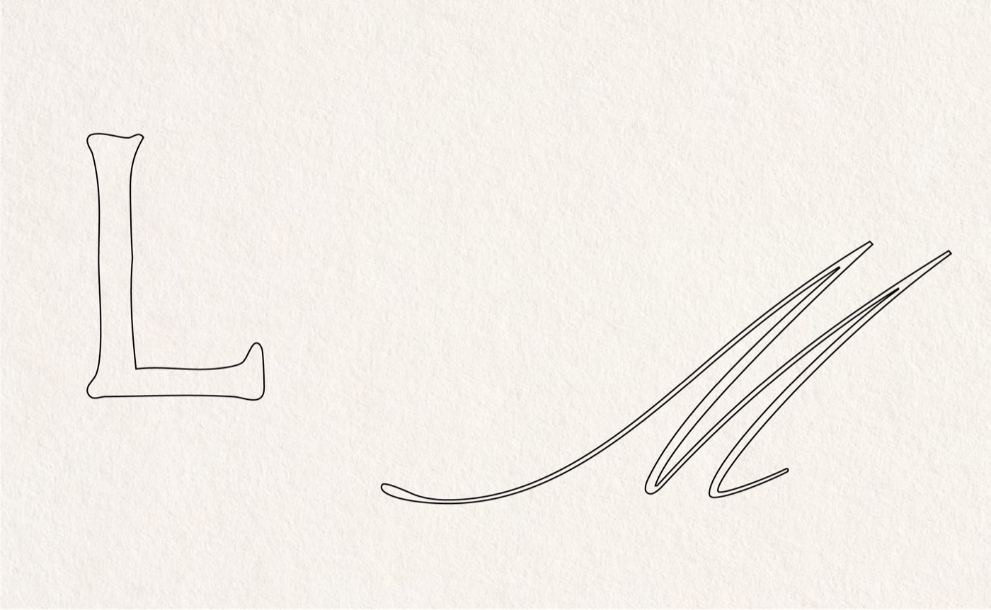
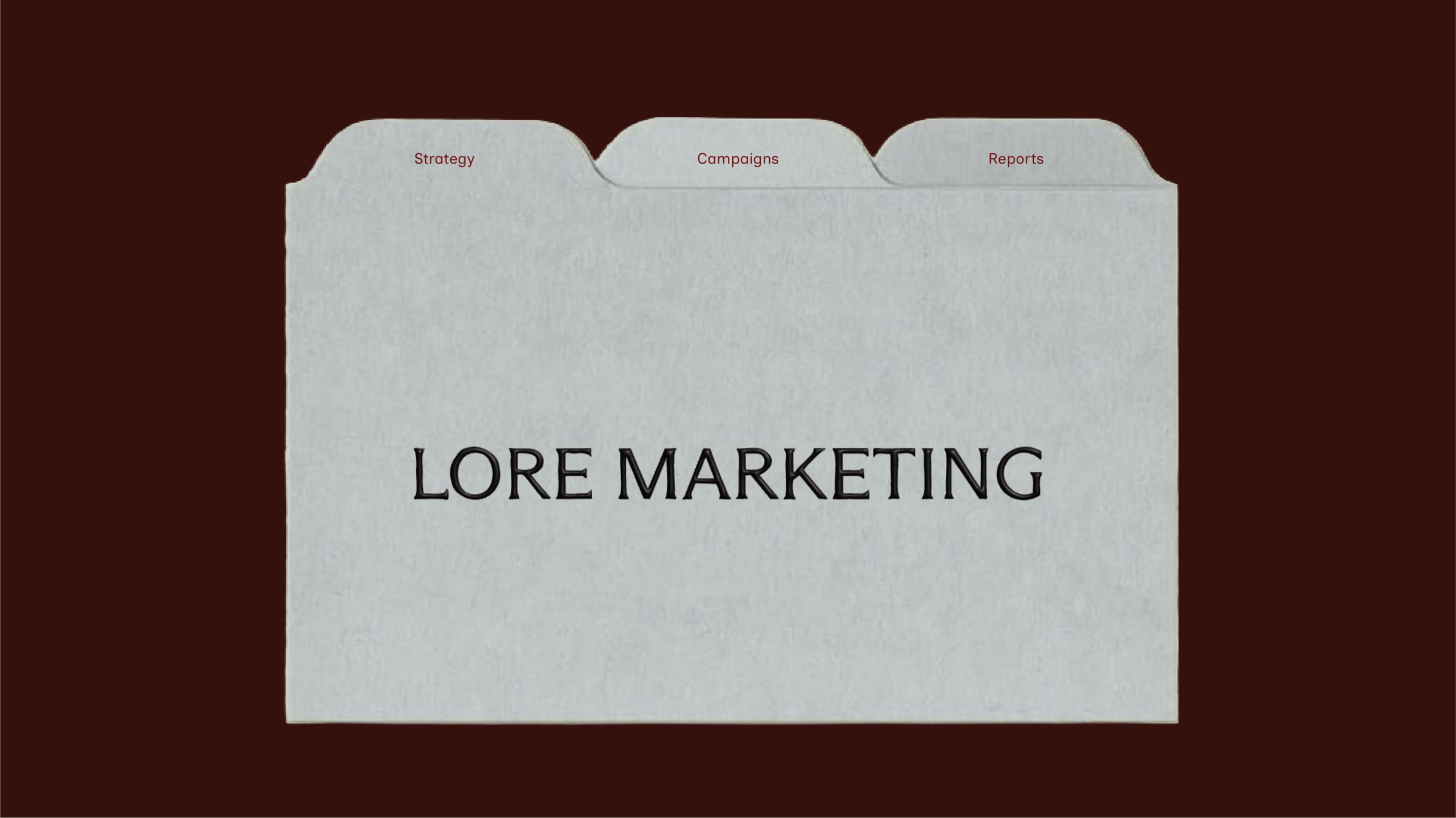
Rather than using a contemporary geometric sans-serif commonly associated with technology or performance marketing, Lore Marketing adopts a classic serif typeface inspired by traditional publishing.
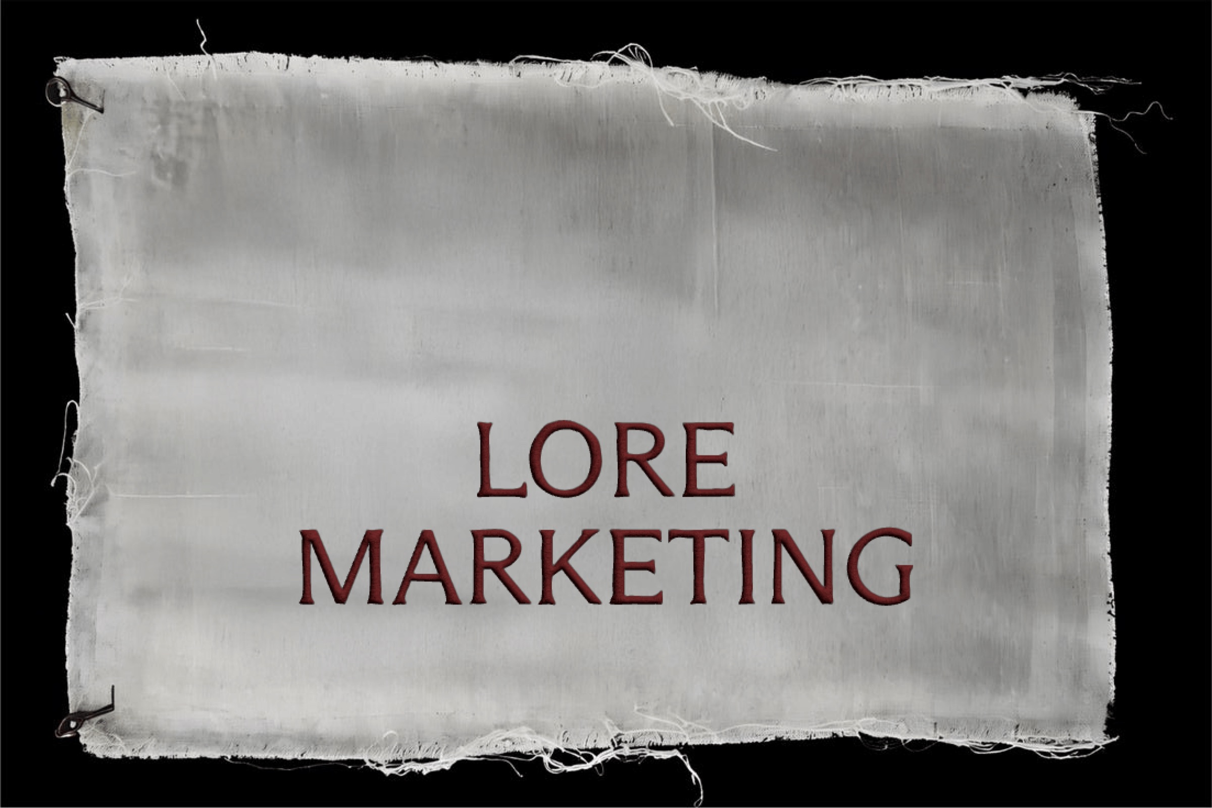
Historically, serif typography has been the preferred choice for books, literature, and long-form reading because of its legibility, rhythm, and timeless character. It evokes trust, authority, and thoughtful communication—qualities that closely mirror Lore Marketing’s role as an educator and strategic guide.
The serif becomes more than a stylistic choice.
It becomes a symbol of:
- knowledge
- storytelling
- credibility
- education
- longevity
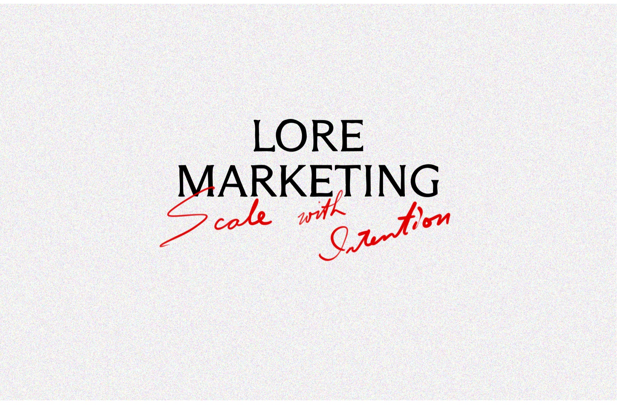
The human signature
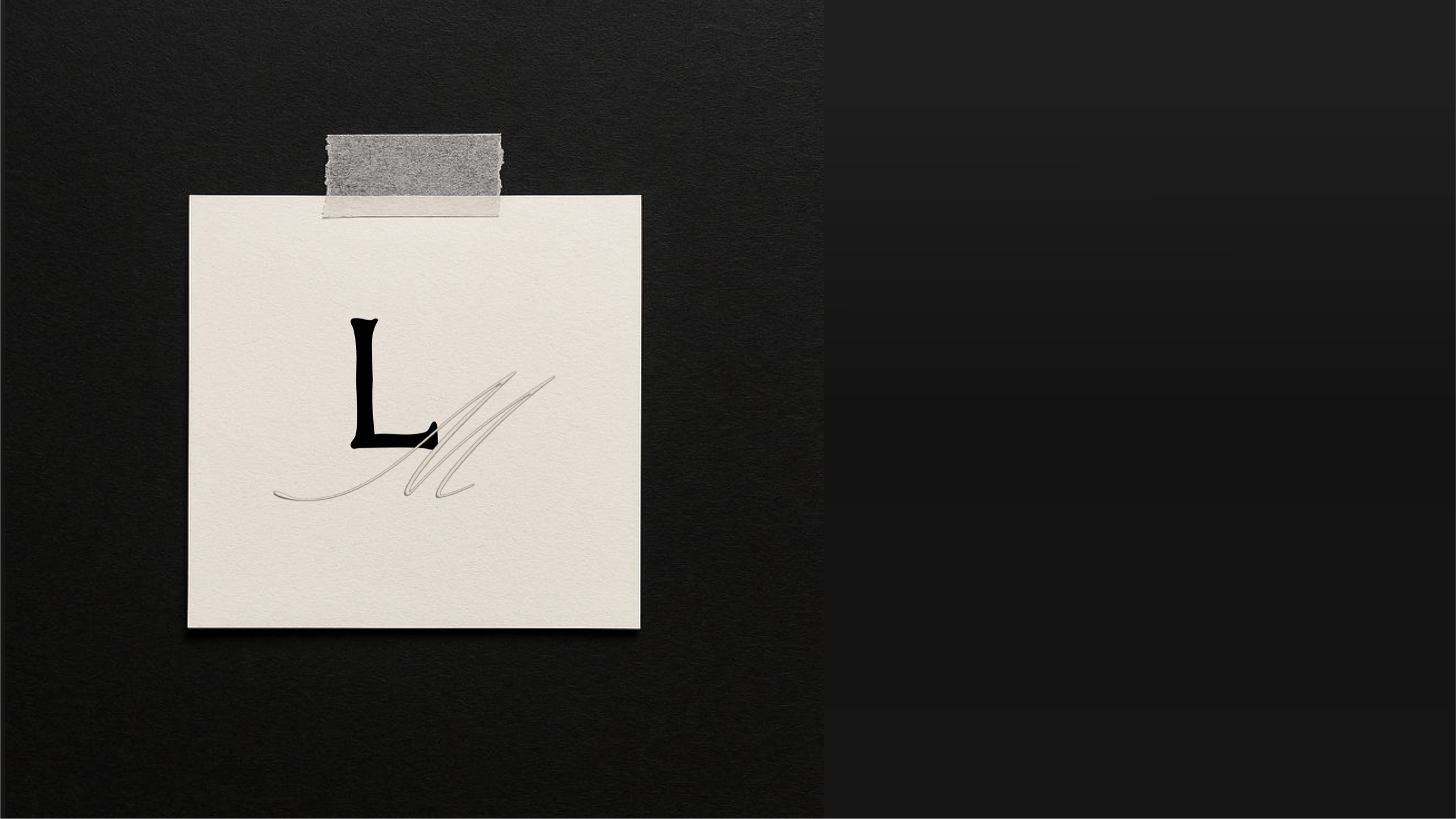
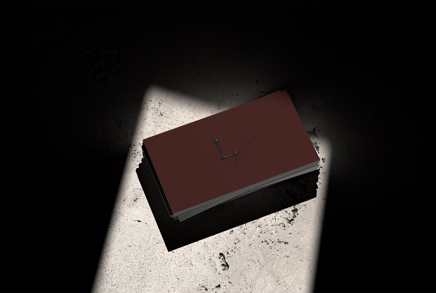
Overlaying the serif typography is a handwritten gesture that introduces an intentional contrast. Where the serif represents systems, structure, and strategic thinking, the handwritten mark represents the person behind the brand.
Personalized Guidance 
Collaboration 
Intuition 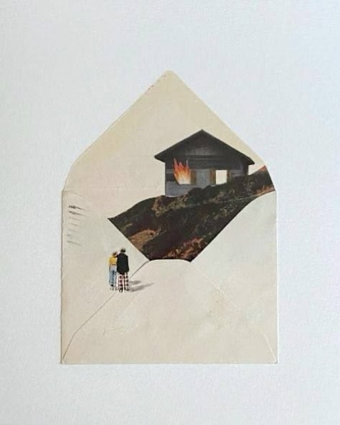
Care 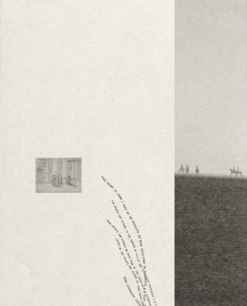
Relationships
Rather than appearing polished through automation or mass production, the handwritten stroke reminds clients that every strategy is shaped by human insight, conversation, and lived experience.

Brand mark
The monogram combines two identities into one symbol.
The initials LM stand for both:
LORE MARKETINGLORRAINE MINOZA
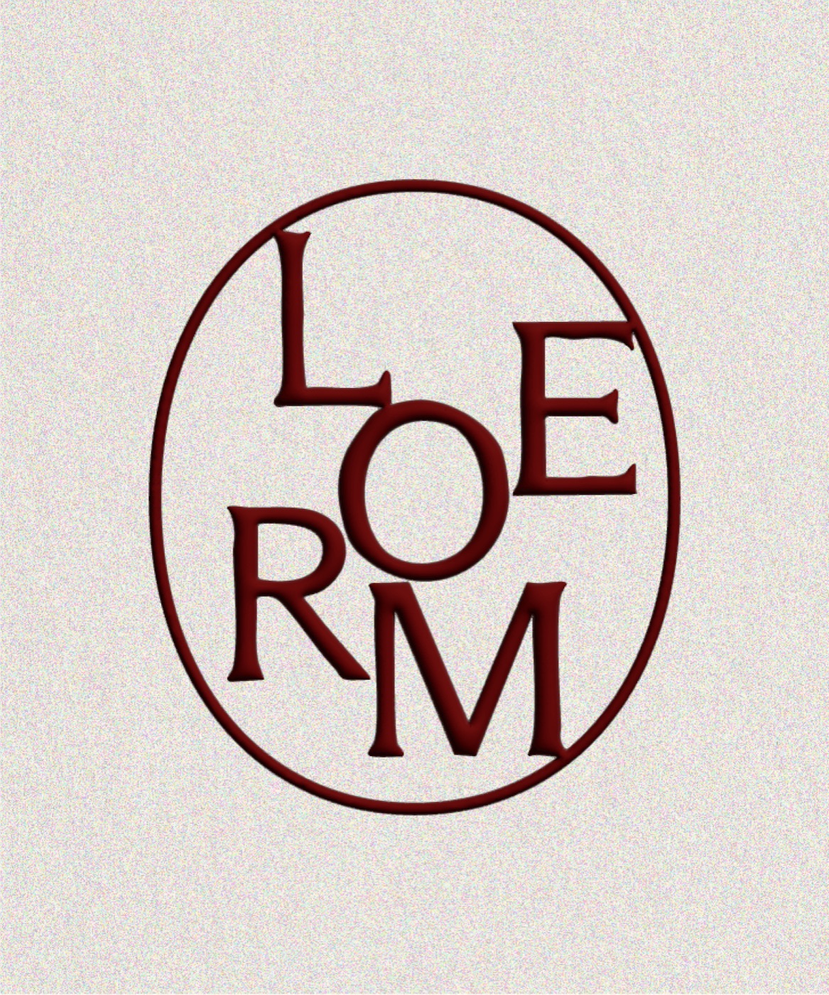
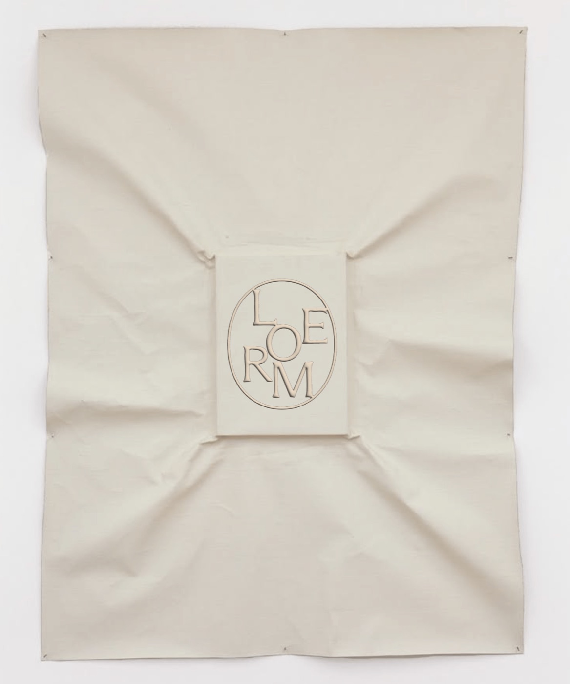
The mark is enclosed within an organic wax-like form inspired by the act of sealing a handwritten letter.
Historically, wax seals represented authenticity, trust, and personal commitment.
It represents the idea that every strategy delivered by Lore Marketing carries a personal promise—not simply a business transaction.
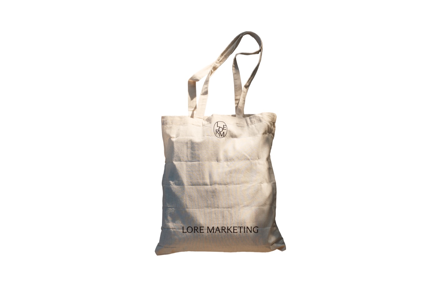
Color system
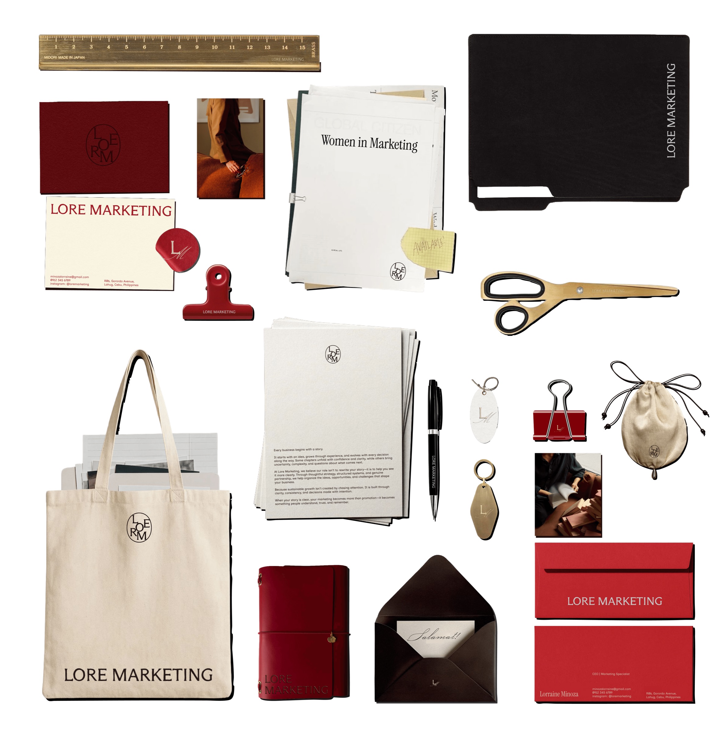
The color palette is intentionally restrained, drawing inspiration from aged paper, bound books, ink, and wax seals.
Rather than relying on bright, trend-driven colors commonly found within the marketing industry, Lore Marketing embraces a palette that feels timeless, grounded, and editorial.
The warm neutrals create space for clarity while the deep reds introduce confidence, passion, and human warmth.
Visual system
The Lore Marketing visual system is built around the relationship between structure and humanity.
Every component exists to reinforce this balance.
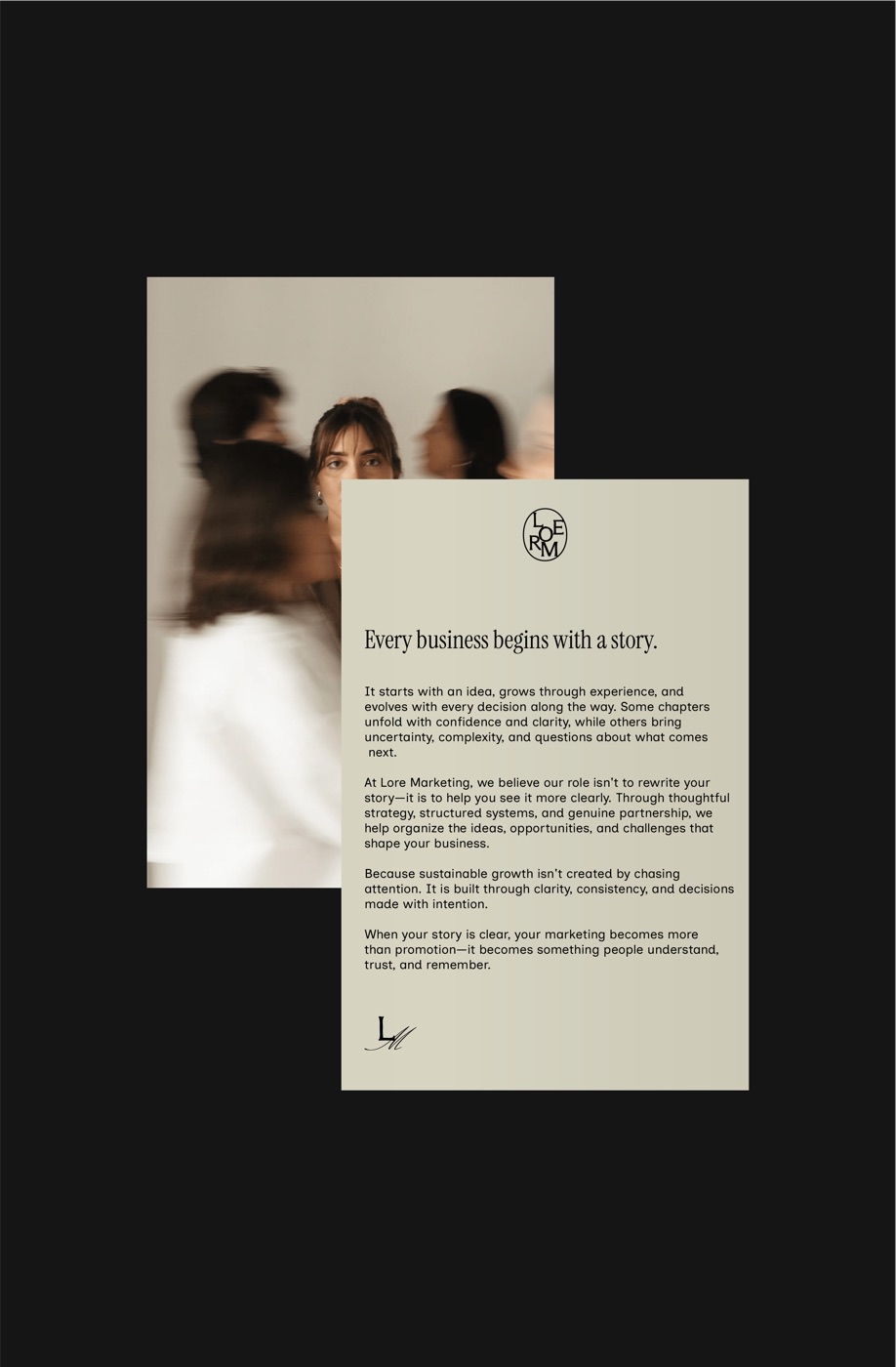
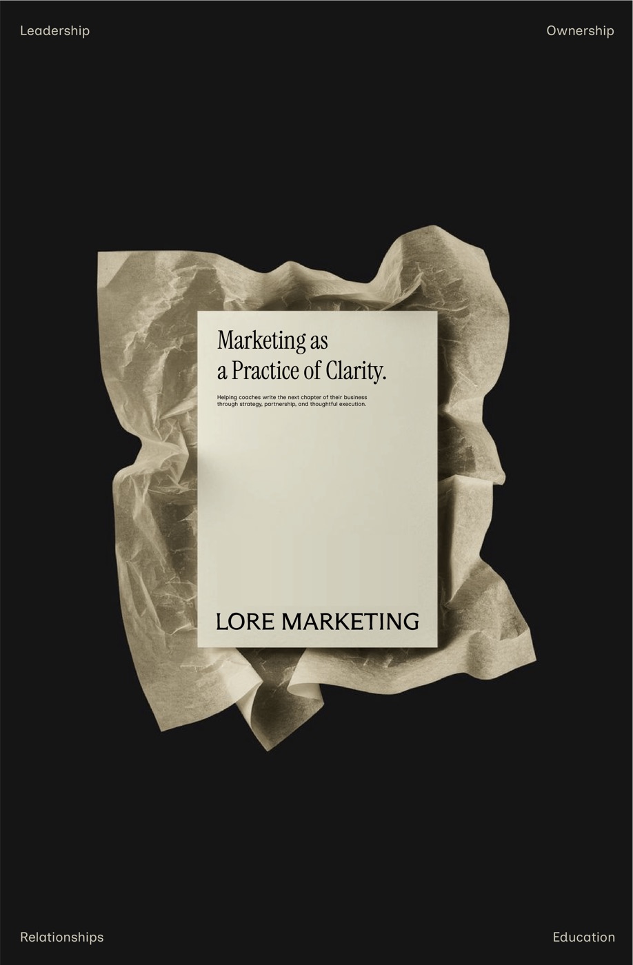
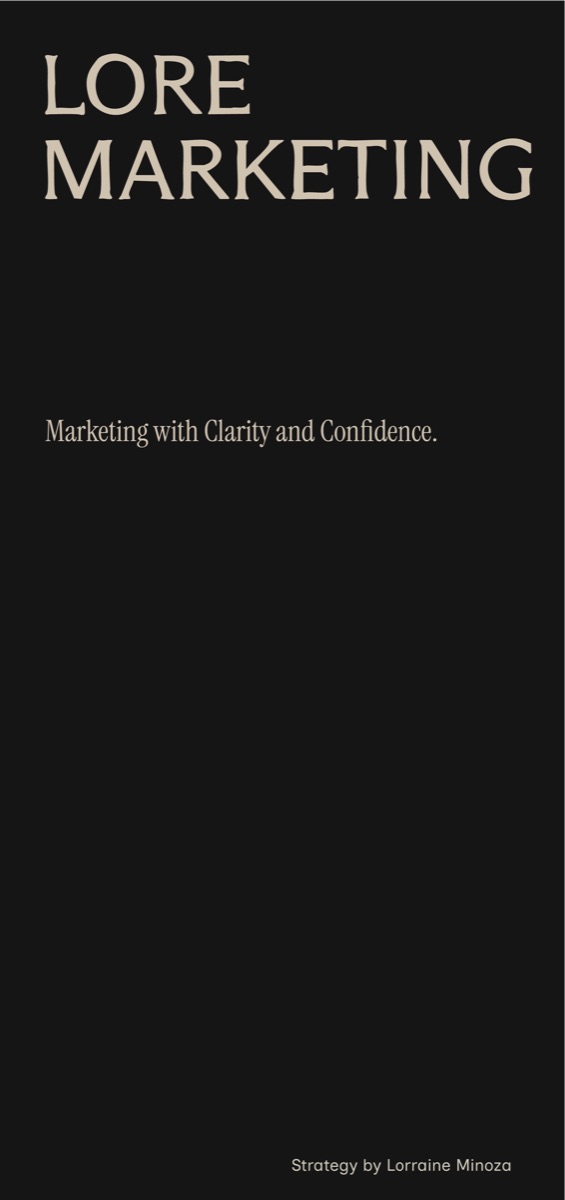
Tap the card to turn it over
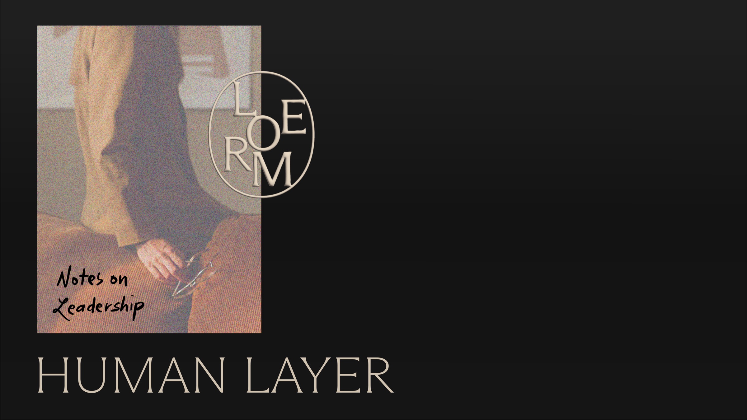
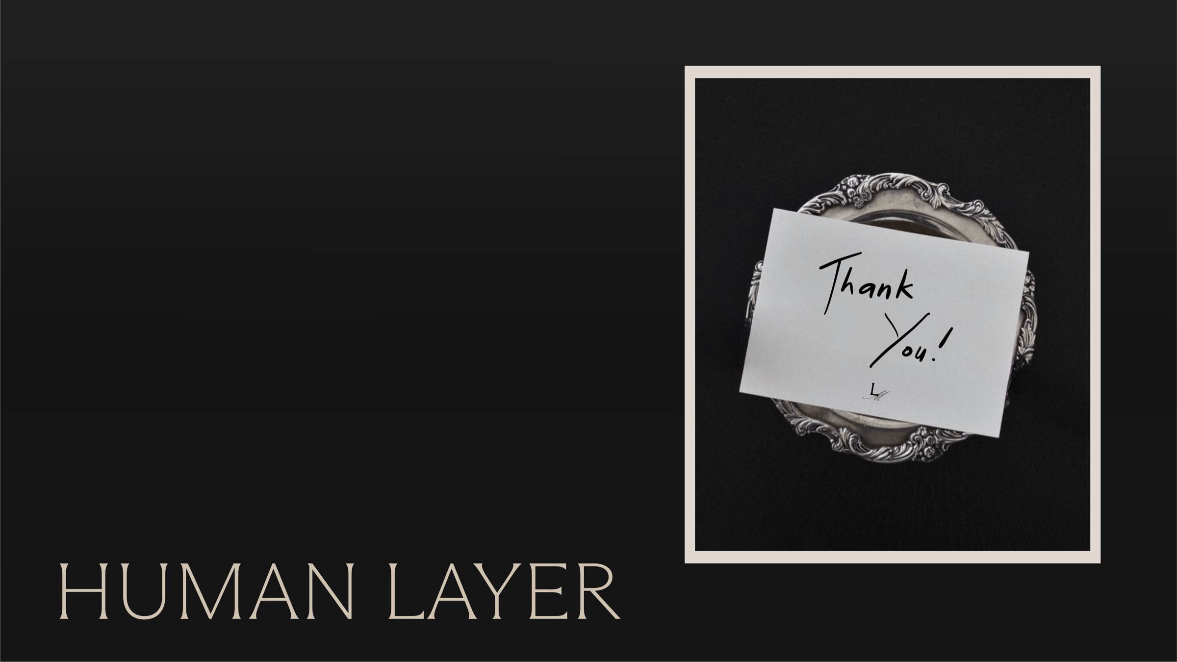
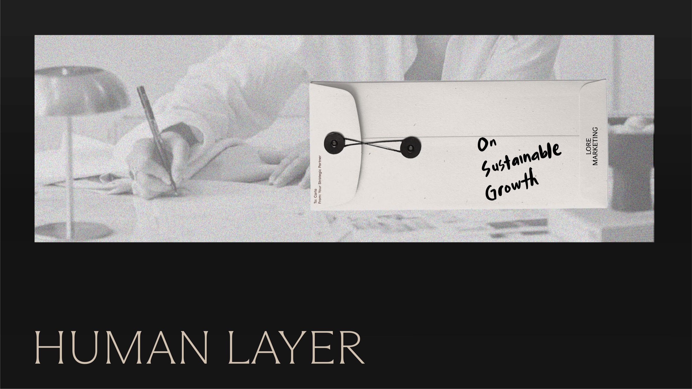
These elements introduce warmth, personality, and authenticity. Together they create a visual language that mirrors the client experience: organized yet personal, strategic yet approachable.
Rather than decorating information, the visual system helps tell stories, explain ideas, and create trust through clarity.
Applications
The visual identity is designed as a flexible system that can scale across every client touchpoint while maintaining consistency. From proposals and presentations to social media, websites, onboarding documents, and educational resources, every application reinforces Lore Marketing’s position as a trusted strategic partner. The combination of editorial layouts, handwritten accents, and refined typography creates an experience that feels cohesive regardless of format.
Whether viewed on screen or in print, the identity remains calm, intentional, and unmistakably Lore.
Social media
Lore Marketing approaches social media as an extension of its educational philosophy rather than simply a promotional channel. The visual identity supports content that teaches, guides, and builds trust over time.
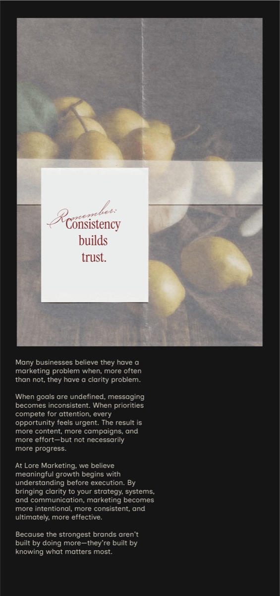
Editorial layouts provide structure for long-form insights. Handwritten elements add personality and emphasize important ideas.
The restrained color palette creates consistency across posts while allowing educational content to remain the primary focus. Rather than competing for attention through visual noise, Lore Marketing earns attention through thoughtful communication and valuable insights.
Every post should feel like a page from a well-loved notebook or a thoughtfully annotated book—inviting audiences not just to consume content, but to learn from it.