To curate East Asian medicine and methods through the power of conversation.
Project overview: An updated vintage
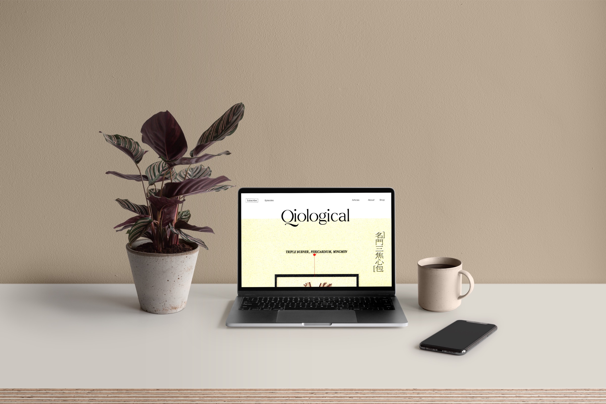
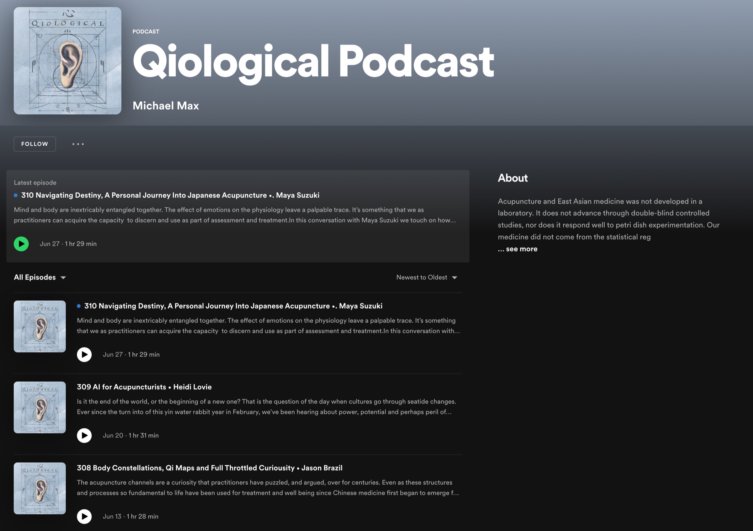
Qiological is Michael Max’s podcast: long-form conversations with practitioners and scholars of East Asian medicine, from acupuncture and herbal medicine to diagnosis, Qi Gong and the practice of practice.
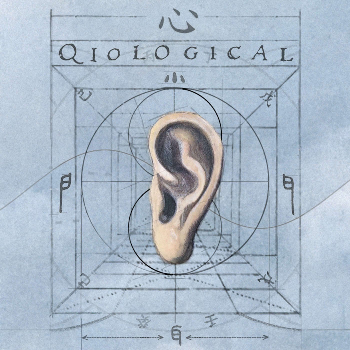
Its first identity was a collage of old anatomy plates, a listening ear, clouds and hand-drawn diagrams. The second version keeps that spirit and its sense of wonder, refined into a calm, timeless system for a growing community: old, made new.
Cultural insight
Podcast listeners seek more than just information or entertainment; they desire a community that is worthwhile, nourishing, and delightfully surprising.
Core values: What every episode should be
Worthwhile
We believe in creating content that is meaningful, valuable, and worth the listener’s time and attention. Our podcast strives to provide insights, knowledge, and stories that leave a lasting impact and make a difference in the lives of our audience.
Nourishing
Our podcast aims to be nourishing, providing intellectual, delightful, and impactful content to our listeners. We are committed to offering episodes that enriches, inspires, and uplifts, leaving our audience feeling nourished and fulfilled after each episode.
Delightfully Surprising
We embrace the element of surprise, aiming to captivate our listeners with unexpected and delightful moments. Our podcast seeks to go beyond expectations, presenting unique perspectives, engaging narratives, and surprising revelations that keep our audience eagerly coming back for more.
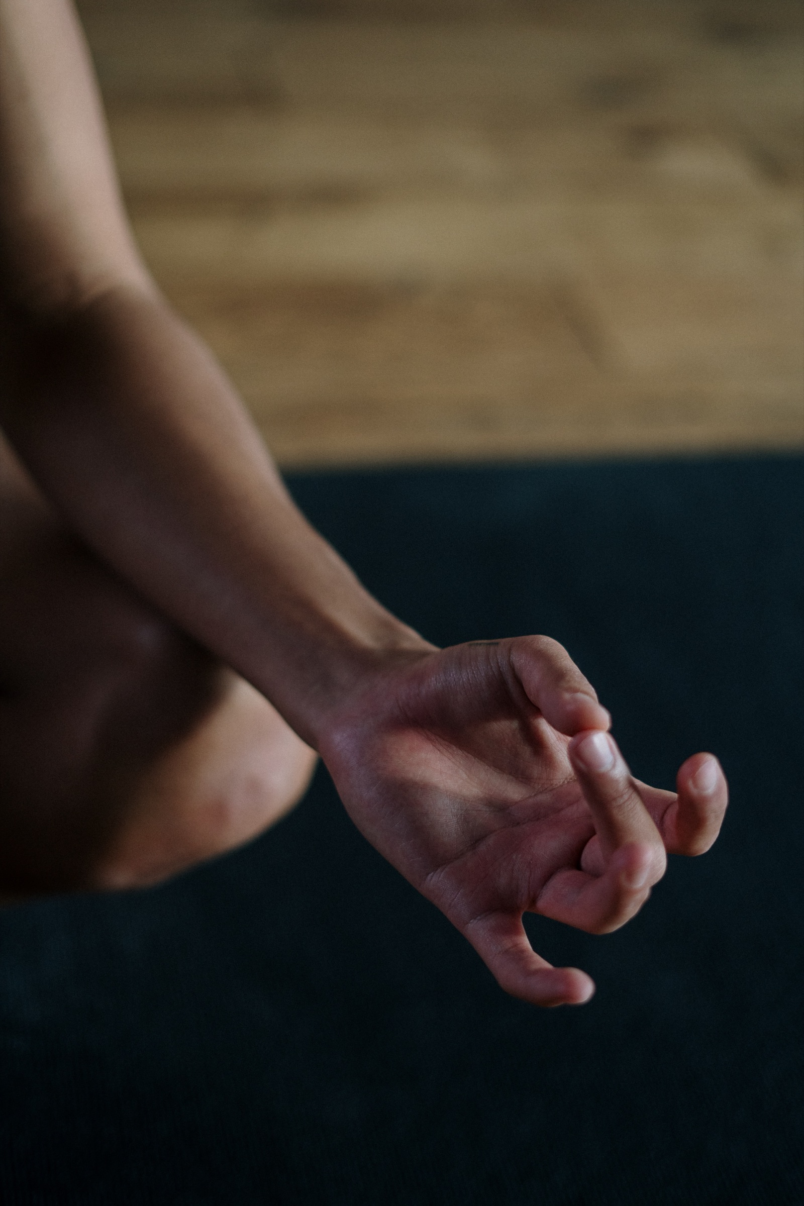 wonder oftenlistenlearn

voice of our
community
Brand essence
Qiological recognizes that podcast listeners seek more than just information or entertainment; they desire a community that is worthwhile, nourishing, and delightfully surprising.
The brand invites listeners to join them on a transformative journey. It is in these values that the brand truly stands out.
Brand logo · old — new: Updated vintage

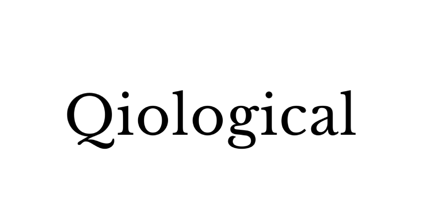
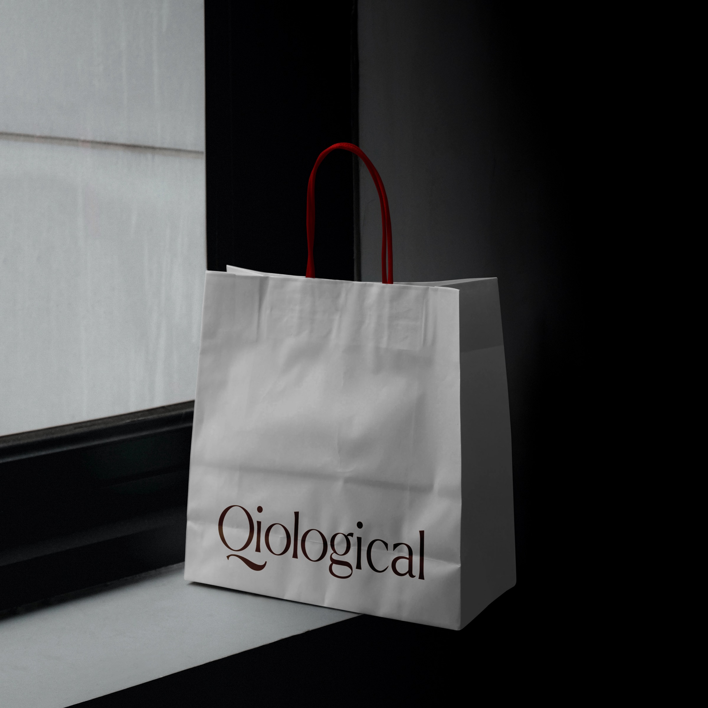
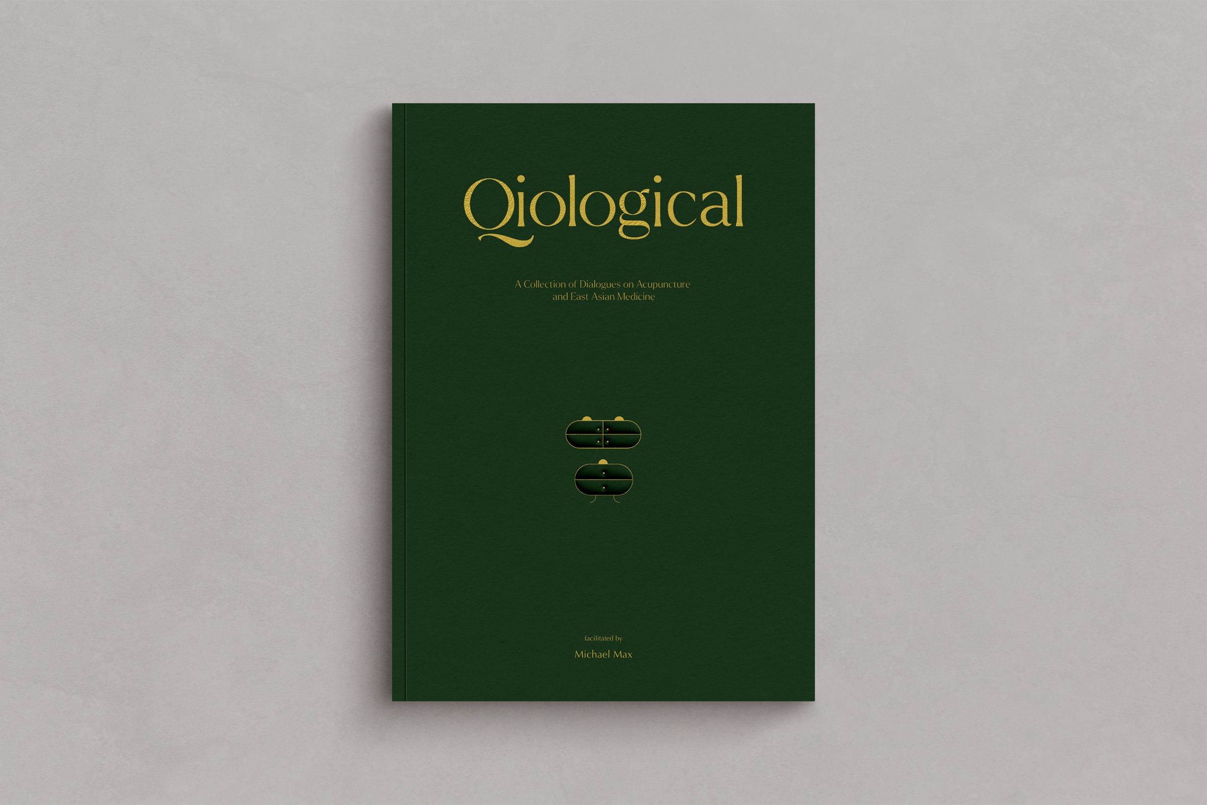
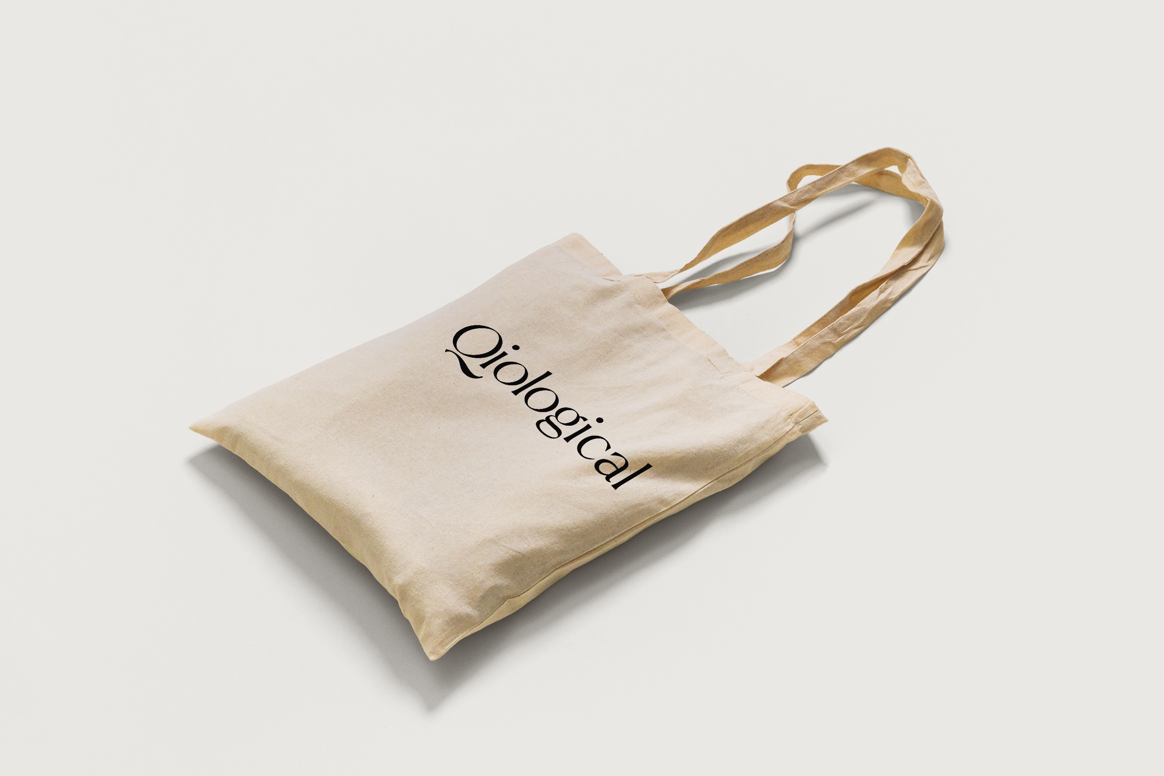
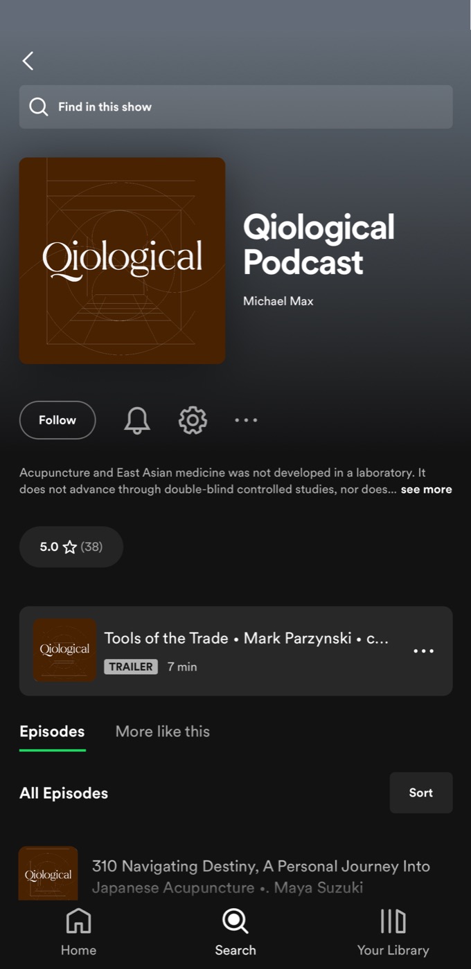
The new logotype keeps the old wordmark’s bookish, vintage serif and sharpens it: finer contrast, open counters and a Q whose tail sweeps under the word like a line drawn in conversation. It sits in black on light grounds, in white on dark, or in contrasting brand colours.
Brand initial: The Q, drawn from balance

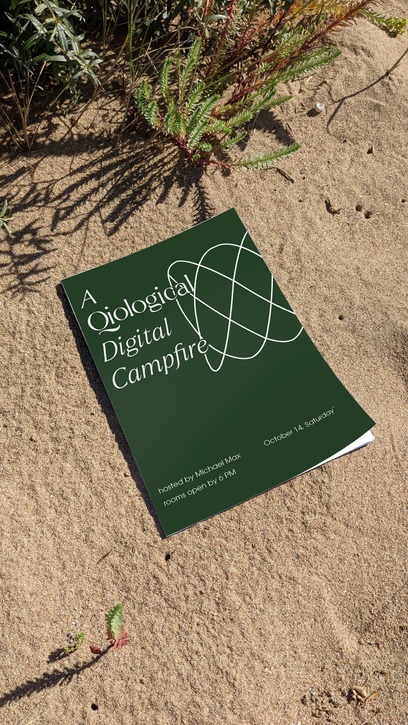
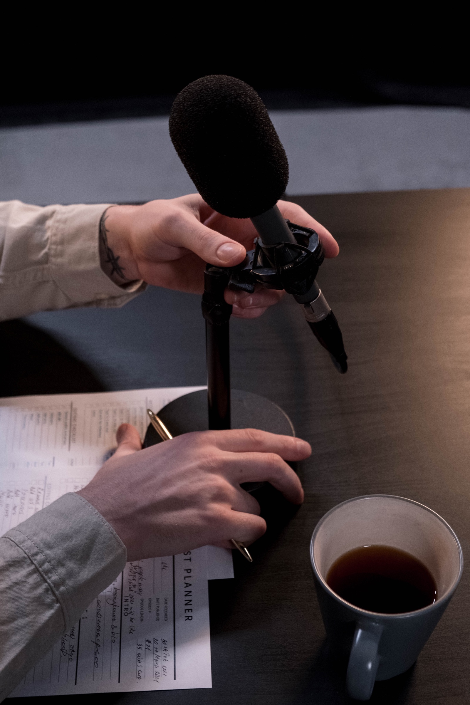
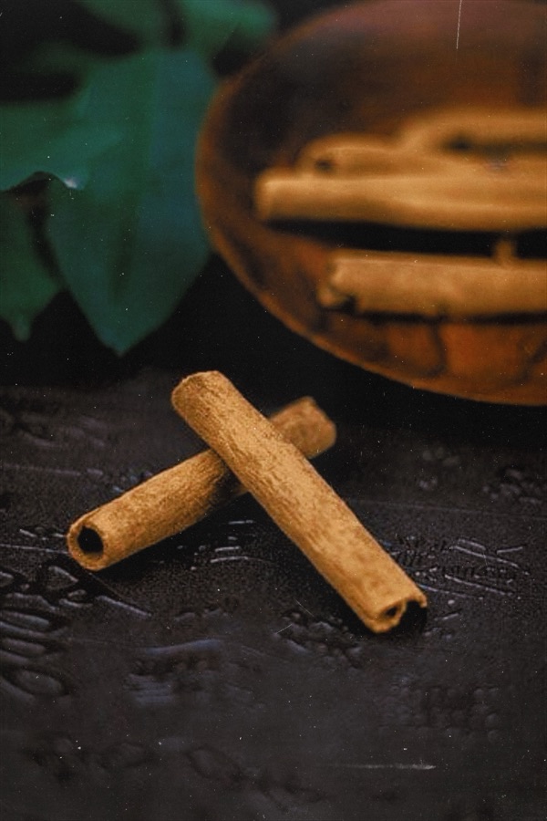
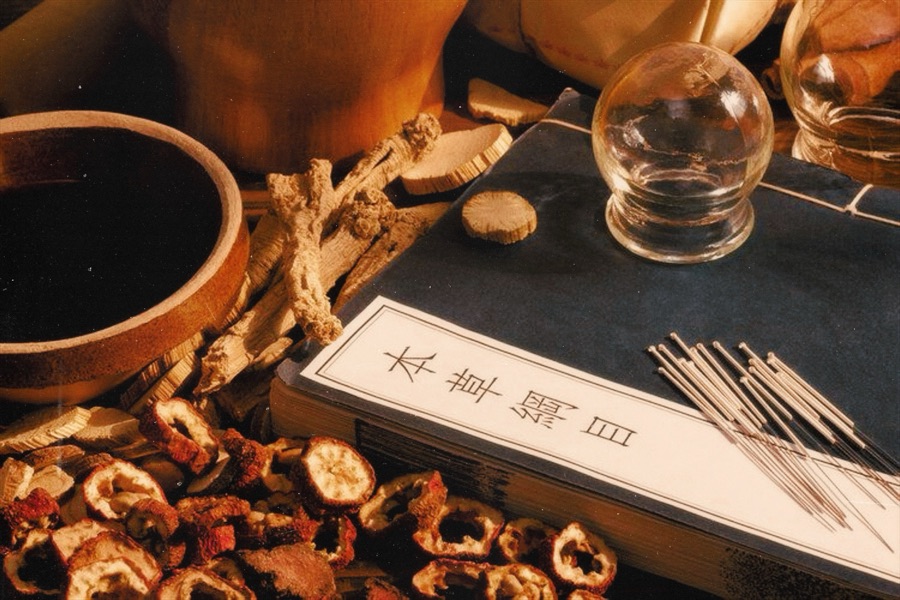
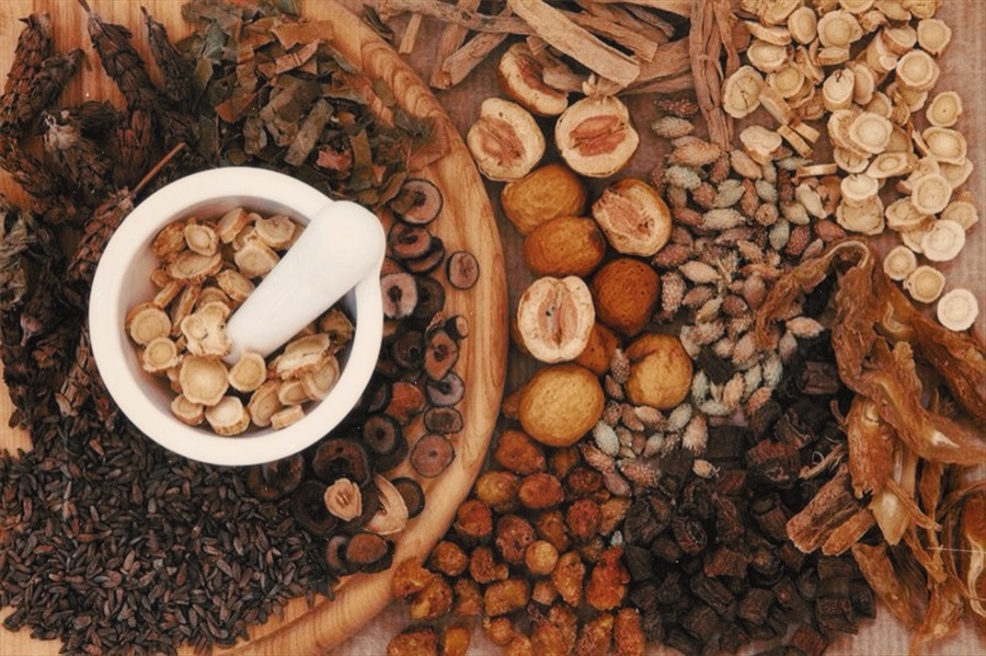
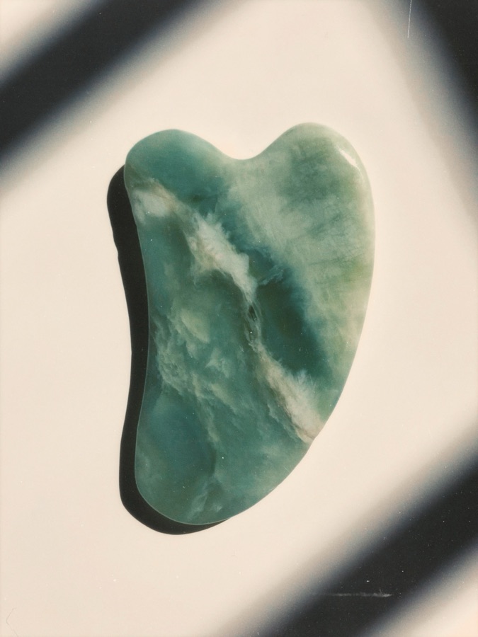
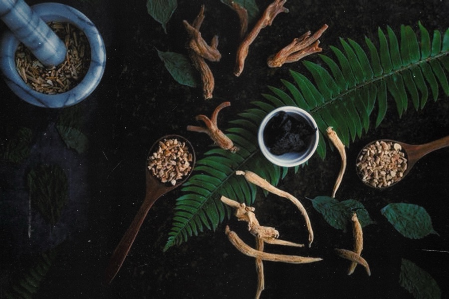
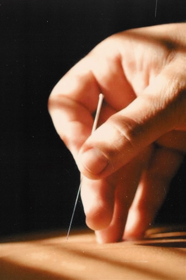
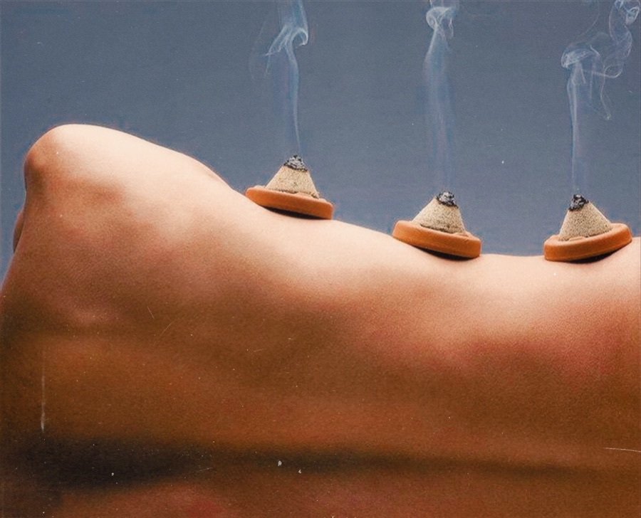
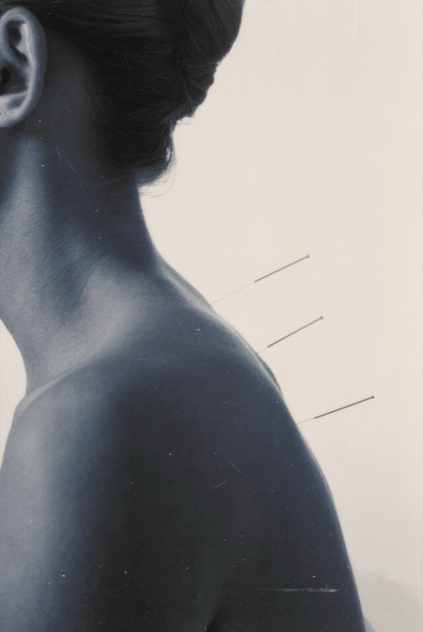
Key visual: Wonder often

Color palette: Umber at the heart
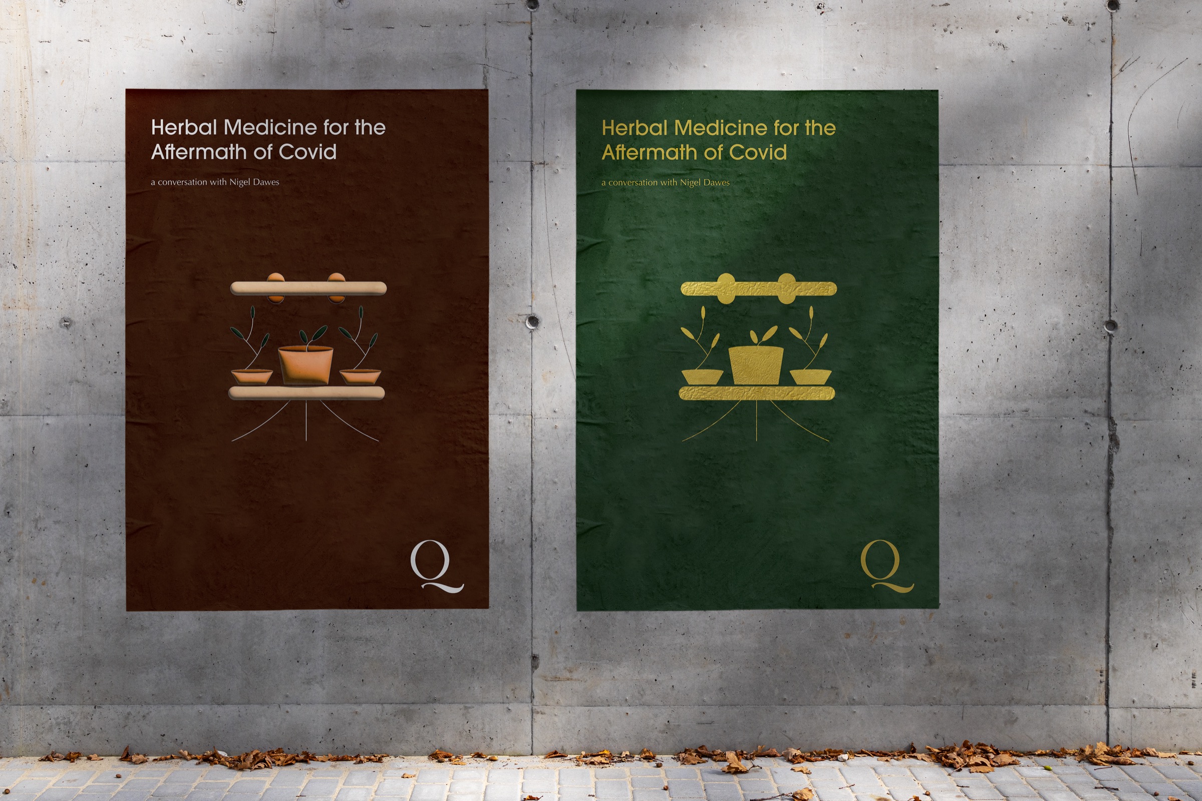
A colour hierarchy runs from Ebony, Ivory and Umber, used as background washes, to Old Gold and Emerald, which convey importance or act as accents. Umber is the hero colour; tints step in increments of 20%.
Primary · headings & pull quotes
Wonder often, listen, learn
Antic Didone Regular
Secondary · body copy & captions
Connecting the voice of our community: conversations on acupuncture, herbal medicine, diagnosis and the practice of practice.
Outfit Regular & Medium
LISTEN NOW
Helvetica Neue · buttons & calls to action
Patterns & icons: From the mark, a language
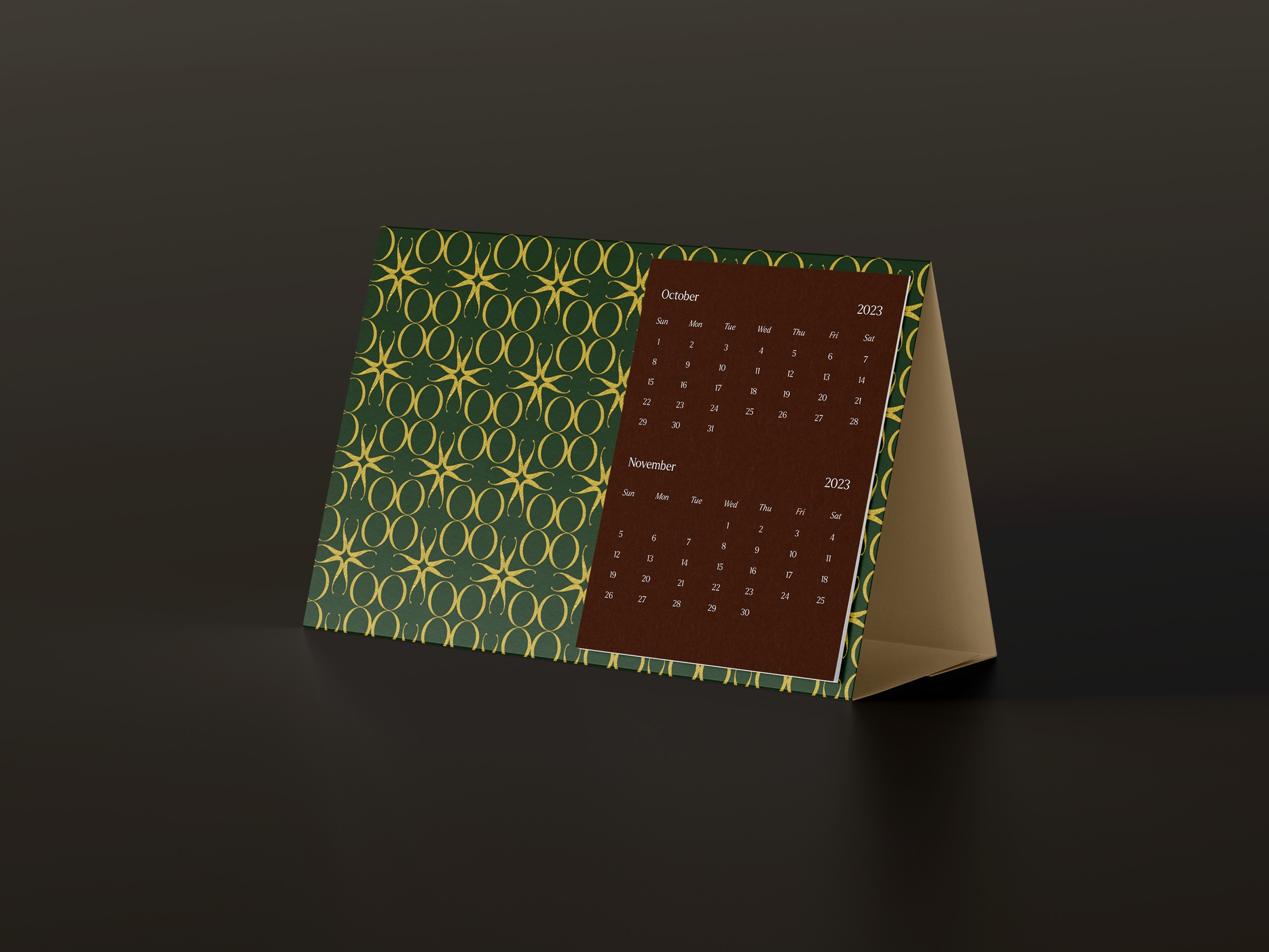
The pattern is developed from the brand mark, and can be explored freely.
Icons represent each subject, as a background wash or to mark and differentiate content.
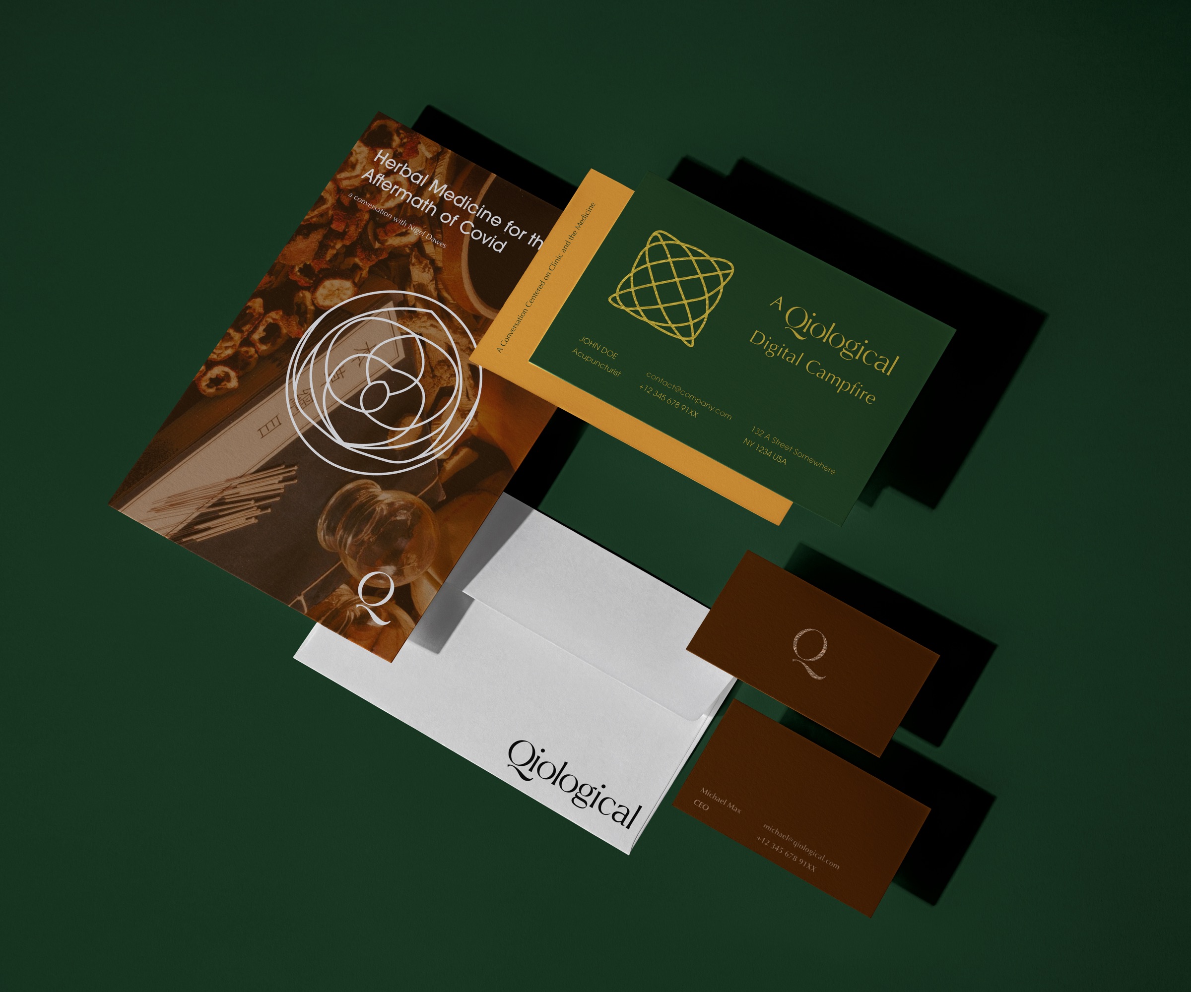
Brand application
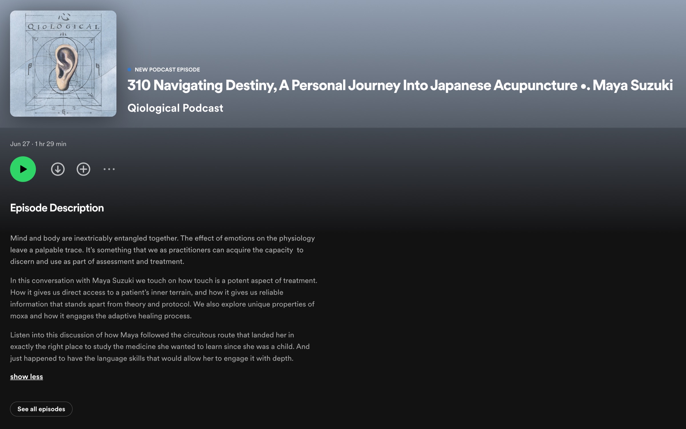
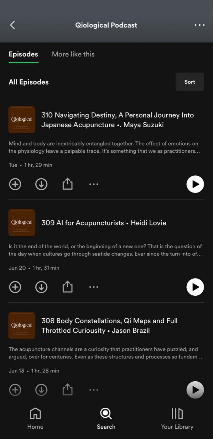
User experience: Wherever people listen
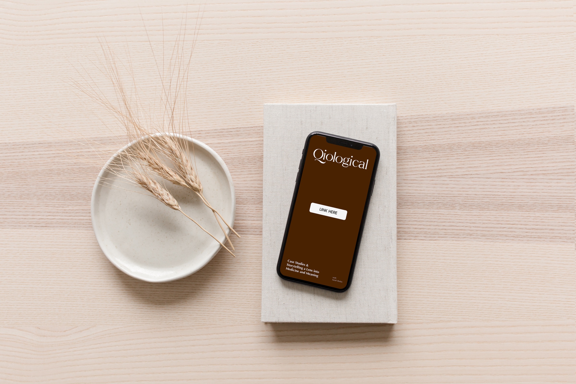
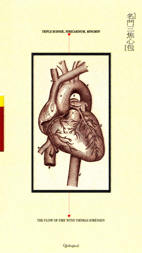
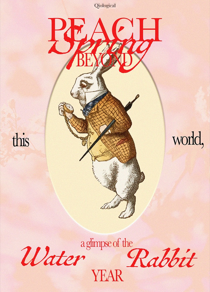
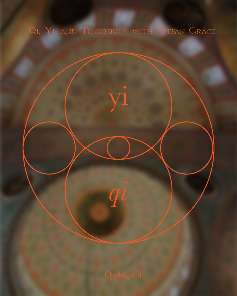
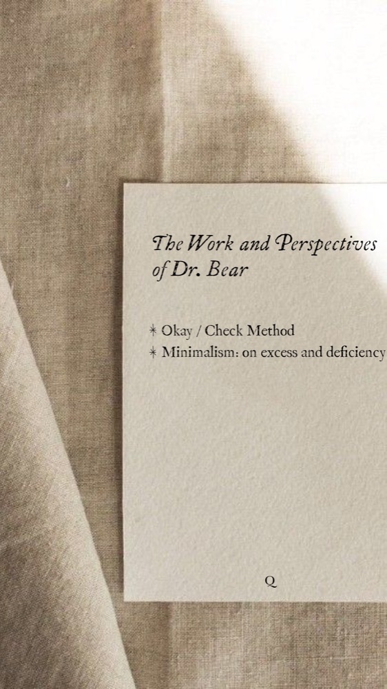
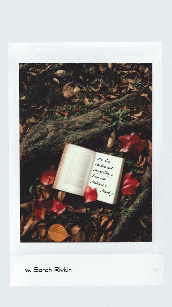
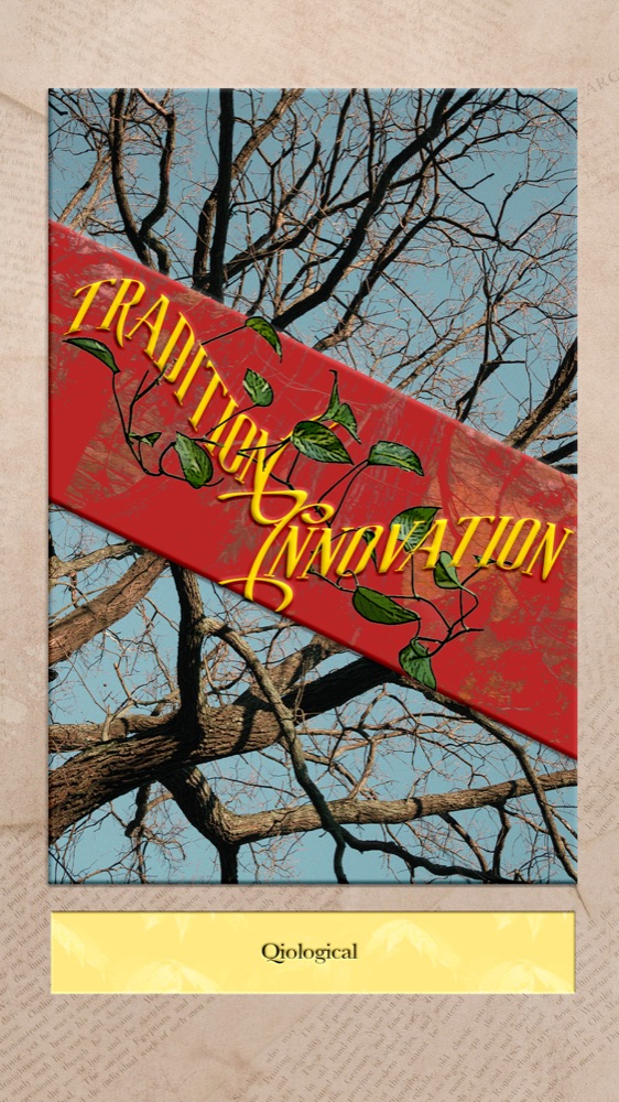
Episode releases on Instagram
To curate East Asian medicine and methods through the power of conversation.