Case study
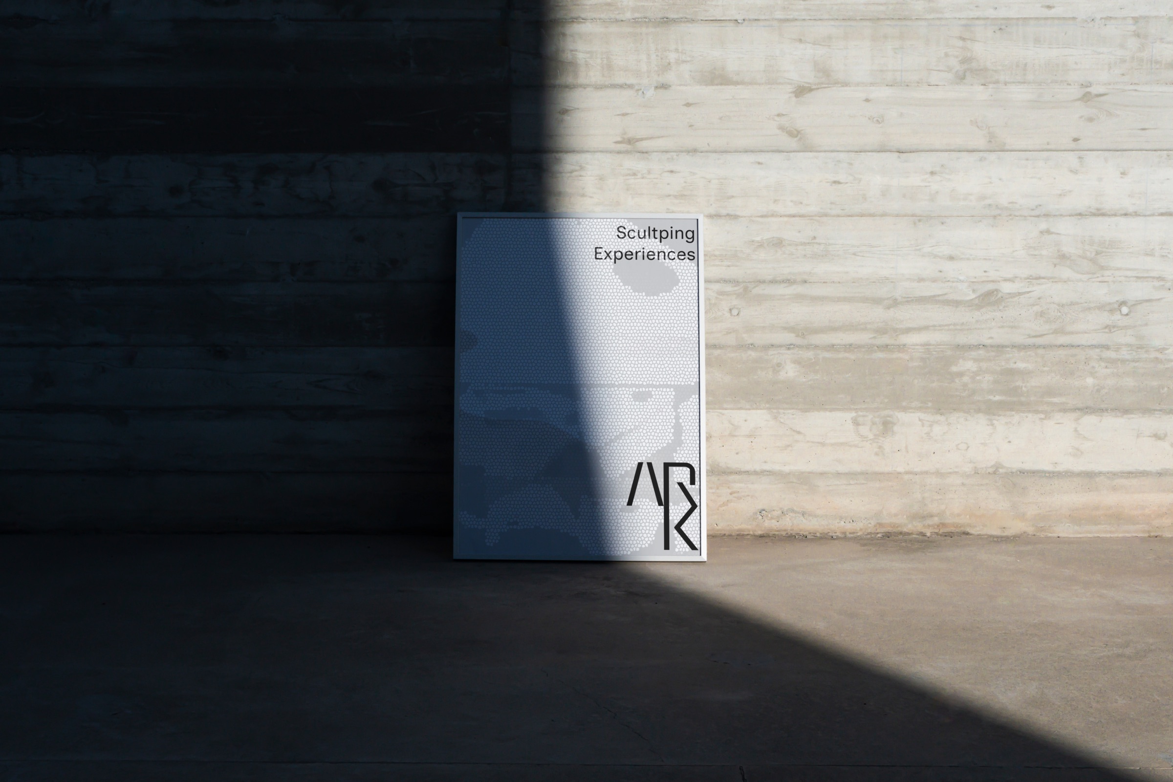
Sculpting Experiences
Project Overview
Arkinamix’s visual identity rebranding aims to create a cohesive and distinctive design system that reflects its dual archetype—The Creator and The Sage—blending artistic vision with architectural authority. This rebrand will refine the logo, typography, color palette, and visual system to enhance brand recognition, market differentiation, and client engagement.
By aligning its identity with its storytelling approach and commitment to innovation, integrity, and sustainability, Arkinamix will strengthen its digital presence, marketing impact, and overall brand experience, positioning itself as a leader in thoughtful, progressive architecture.
- The CreatorVisionary, expressive
- The SagePrecise, knowledgeable
Cultural Insight
Filipino clients increasingly seek architecture that balances visionary design with deep meaning, yet many hesitate due to a lack of clarity, accessibility, or trust in the process. Arkinamix’s rebrand bridges this gap by merging artistic creativity with architectural wisdom, positioning the firm as both an innovator and mentor.
By refining its visual identity to reflect depth, intentionality, and transformation, Arkinamix will reshape cultural perceptions of architecture, making thoughtful, progressive design more engaging and accessible.
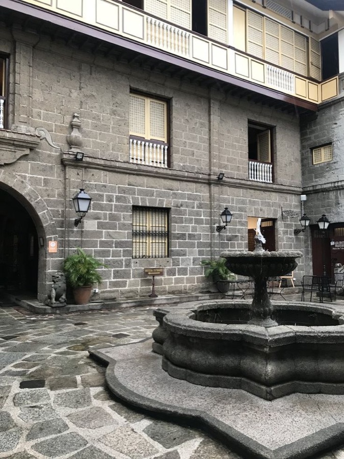
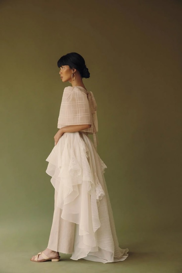
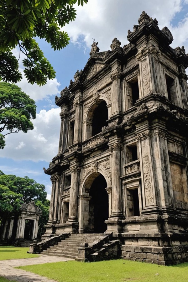
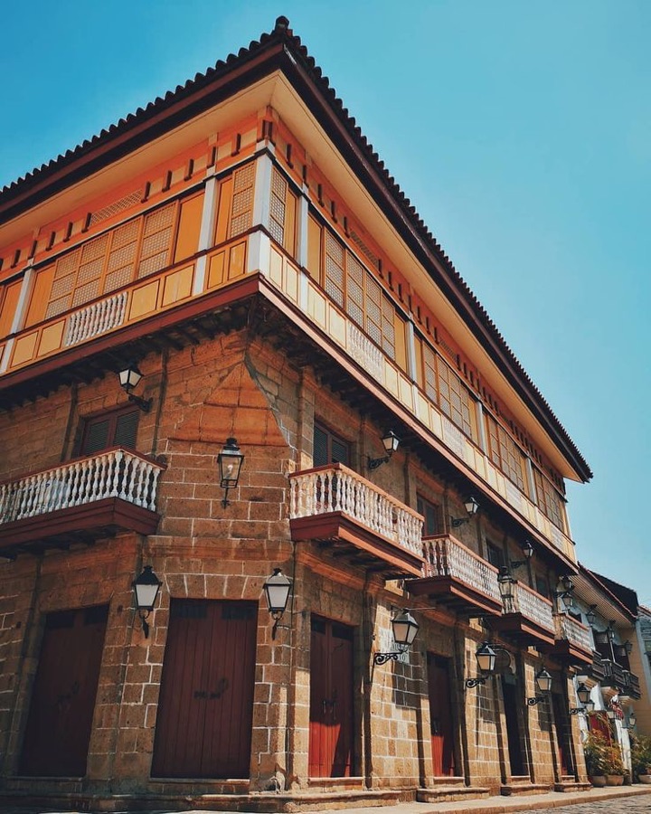
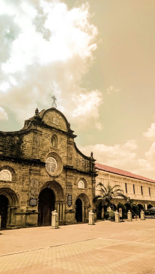
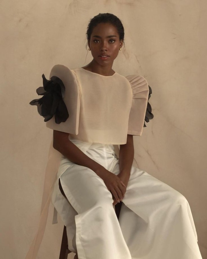
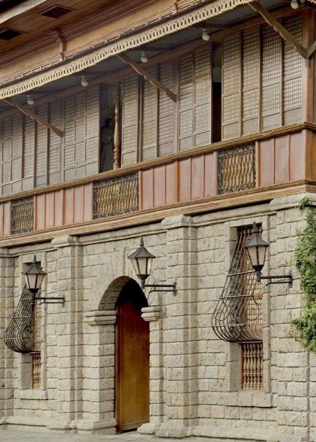

Reference images from the visual identity presentation: heritage Filipino architecture alongside the people Arkinamix designs for.
Core Values
Arkinamix’s core values—Intentionality, Integrity, and Innovation—serve as the foundation of its brand identity, shaping both its approach to architecture and how it visually presents itself. These values ensure that every design decision is purposeful, transparent, and forward-thinking, reflecting the firm’s commitment to thoughtful, progressive architecture.
When crafting the visual identity, it is essential that these values are not just stated but visually expressed. Intentionality calls for a design system that feels deliberate and meaningful, avoiding excess while maintaining depth. Integrity demands a brand that communicates clarity and trust, using a structured, professional aesthetic that feels accessible and reliable. Innovation encourages modern, boundary-pushing elements, integrating progressive design choices that set Arkinamix apart in the industry.
Arkinamix believes that architecture should transcend aesthetics, shaping spaces that evoke emotion, functionality, and narrative. Every design decision is deliberate, ensuring that structures not only serve a purpose but also enrich the lives of those who experience them.
Honesty is the foundation of Arkinamix’s practice, ensuring clear communication, ethical decision-making, and responsible craftsmanship. From concept to execution, the firm prioritizes accountability and openness, fostering strong, trustworthy relationships with clients, collaborators, and communities.
Arkinamix thrives on exploration and progress, merging bold creativity with practical solutions to craft architecture that challenges conventions and anticipates the future. By embracing new materials, technologies, and methodologies, the firm redefines what is possible, ensuring sustainability, adaptability, and lasting impact in every project.
Brand Slogan
At its core, Arkinamix is more than an architectural firm—it is a storyteller of space, a sculptor of depth, and a creator of meaning. Every project is a dialogue between art and function, creativity and wisdom, where architecture is not just about constructing buildings but about shaping experiences that resonate deeply with those who inhabit them.
Brand Logo
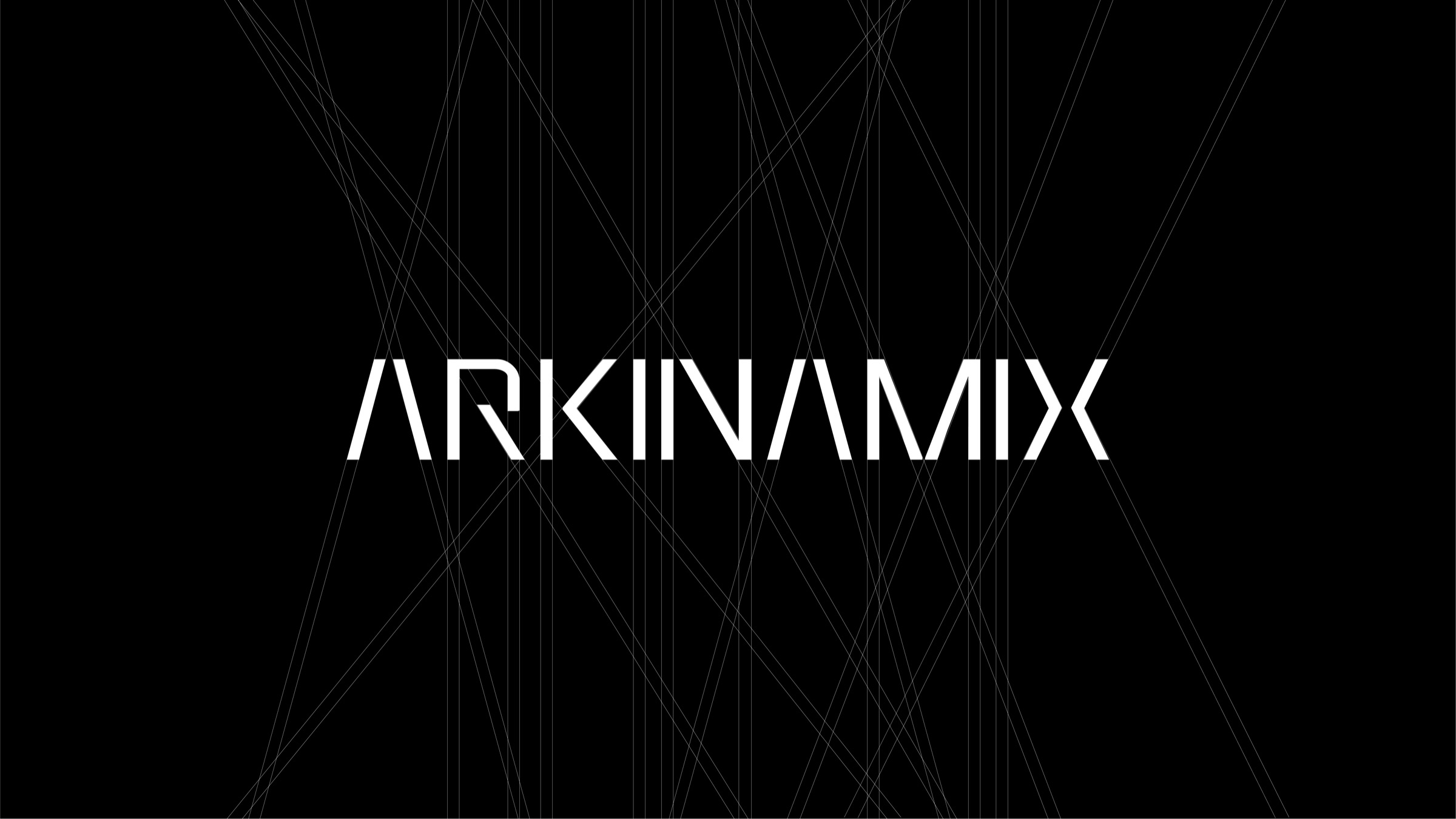
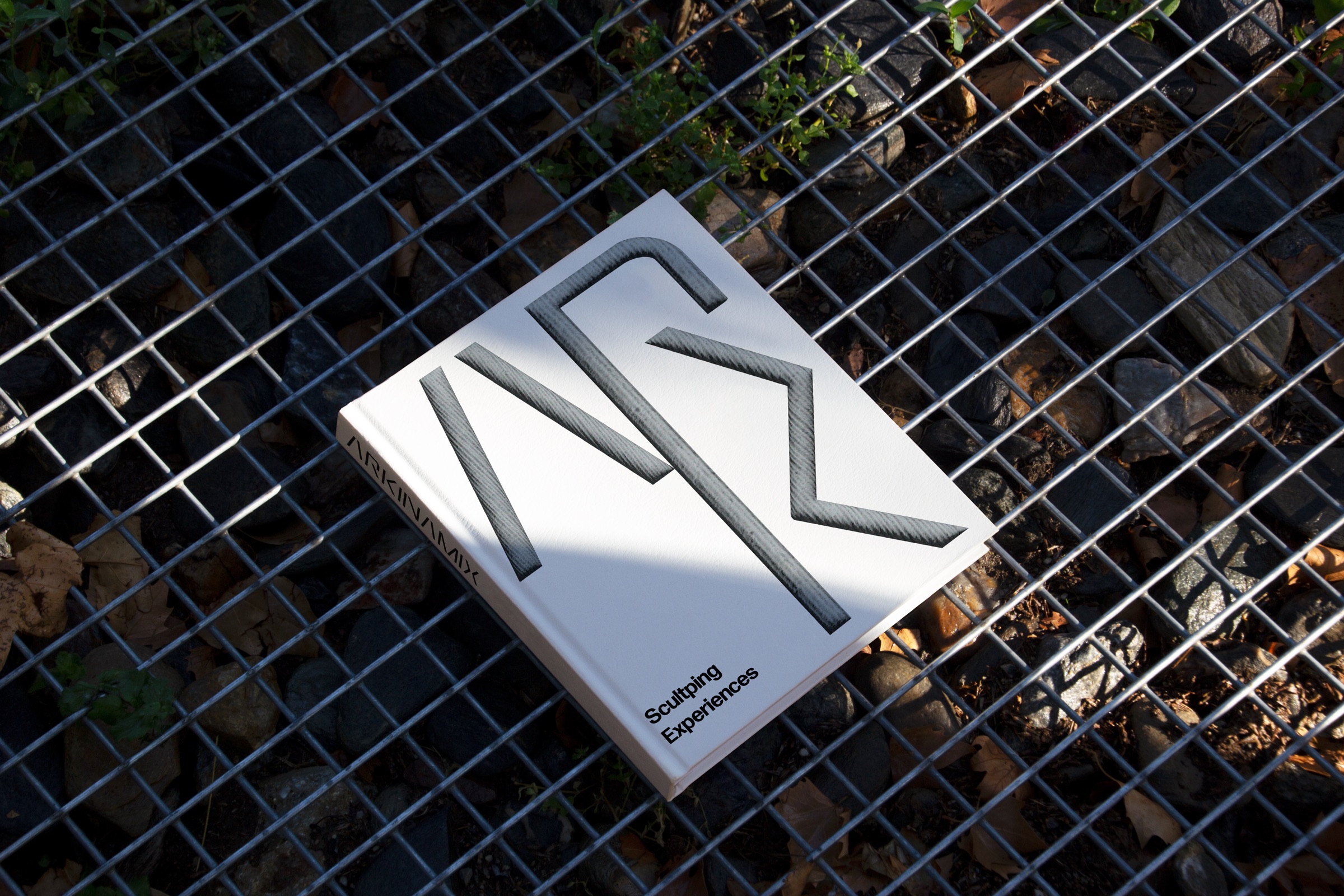
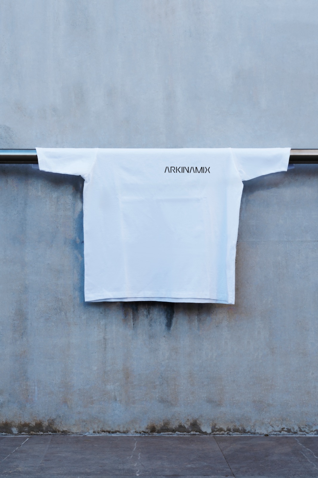
The Arkinamix logo embodies the firm’s philosophy of sculpting depth and designing meaning, blending artistic vision with architectural precision. Starting with Kade Regular, we customized the typography by integrating angles and edges that suggest movement and transformation, reflecting Arkinamix’s commitment to pushing boundaries in Philippine architecture.
The interplay of structure and dynamism mirrors the firm’s dual archetype—The Creator (visionary, expressive) and The Sage (precise, knowledgeable)—ensuring the logo feels both intentional and progressive. This refined yet minimal mark acts as a visual blueprint of Arkinamix’s design ethos, where every detail serves a purpose, reinforcing a brand identity that is timeless, innovative, and deeply connected to the spaces it shapes.
The starting point: Kade Regular, set wide.
Spacing evened out and the I simplified, for balance and readability.
Angles and edges cut into the letterforms, suggesting movement and transformation.
The initials, taken from the finished wordmark.
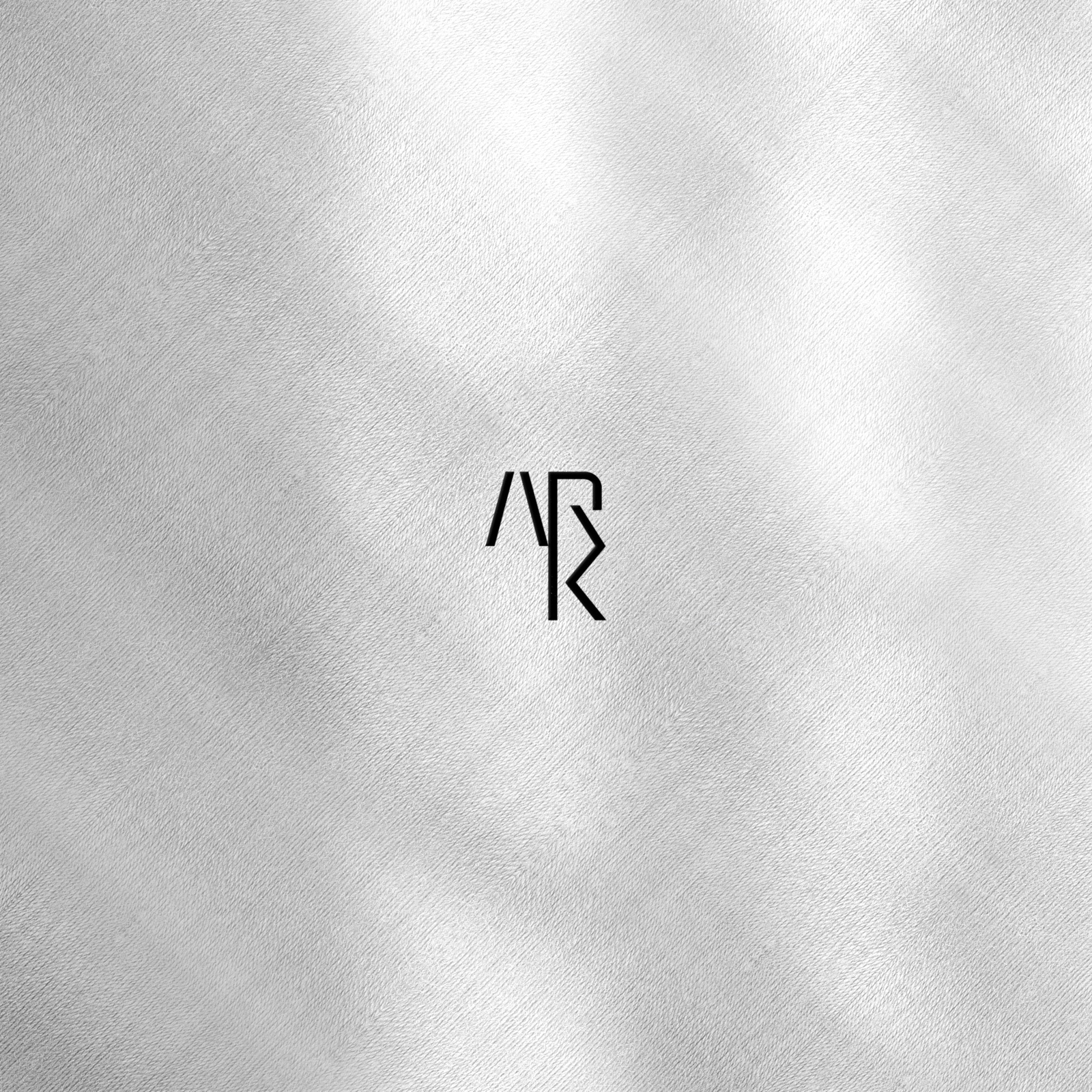
AR set above K as a monogram.
The K redrawn to sit under the R: the final monogram.
a SCULPTED aesthetic
These custom modifications reinforce Arkinamix’s brand philosophy, ensuring that the mark is neither purely geometric nor overly ornamental—it exists in a space where precision meets artistic interpretation. Much like the firm’s approach to architecture, the mark is a thoughtfully crafted identity, where every detail is purposeful, reinforcing the brand’s commitment to depth, intentionality, and innovation.

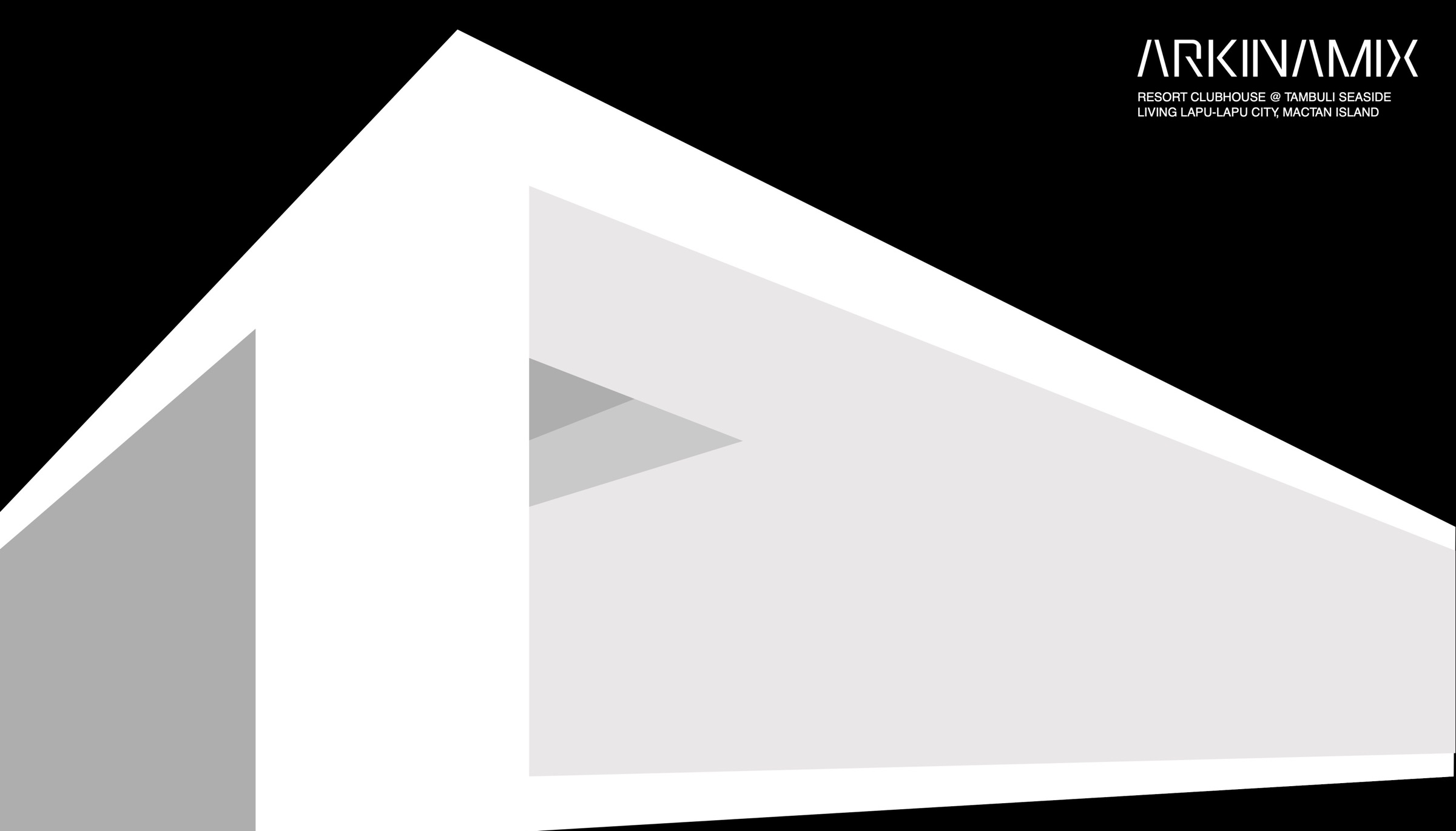
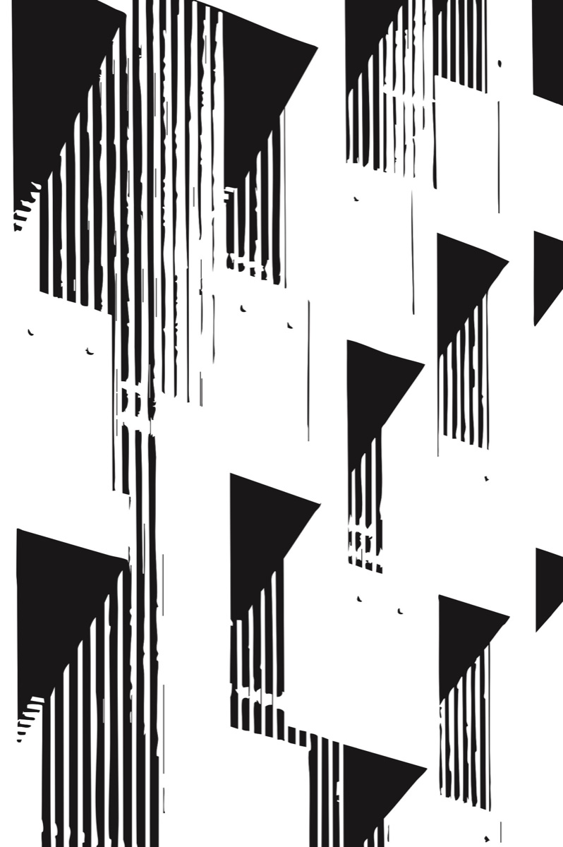
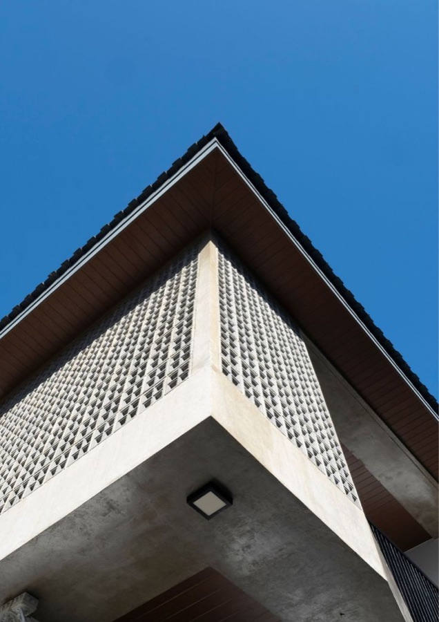
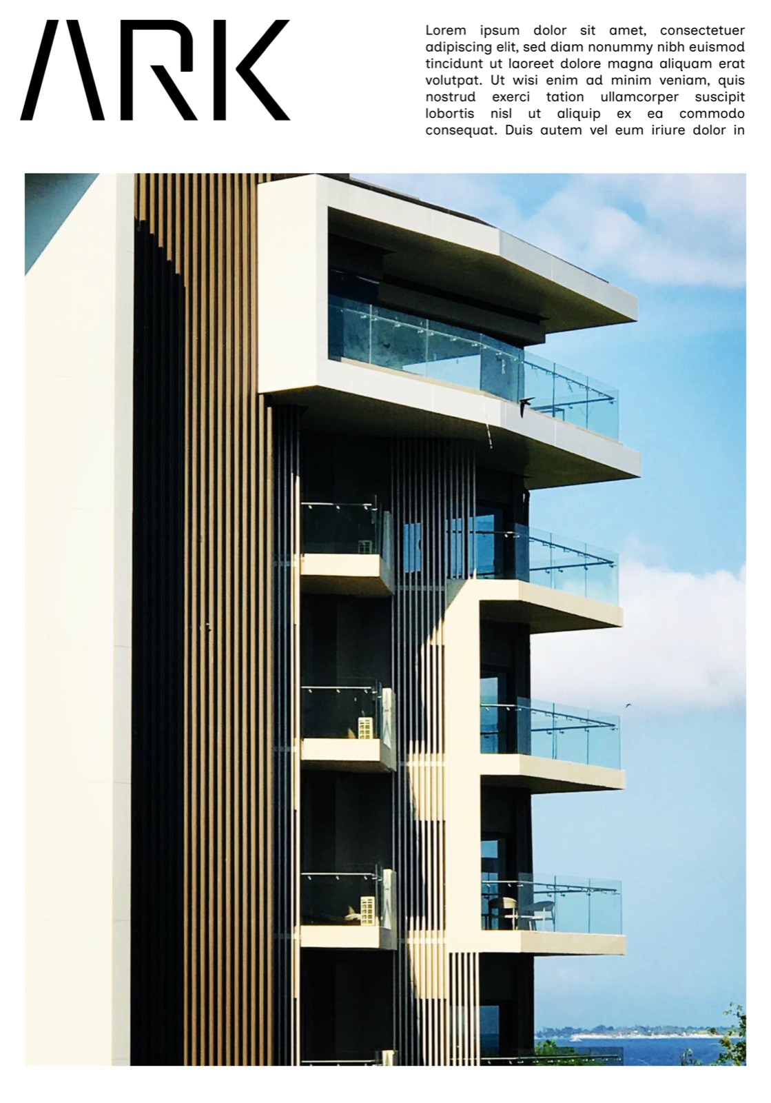
Phase 1 Residential Towers @ Tambuli Seaside Living, Lapu-Lapu City, Mactan Island
- Explored how the negative spaces within the letters R, A, and X
- could serve as the foundation for a symbolic system
- representing the firm’s core project categories:
A Dynamic, Architectural Visual System
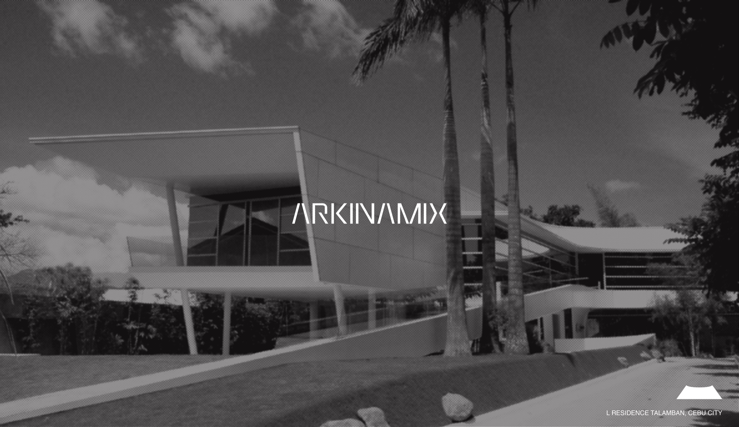
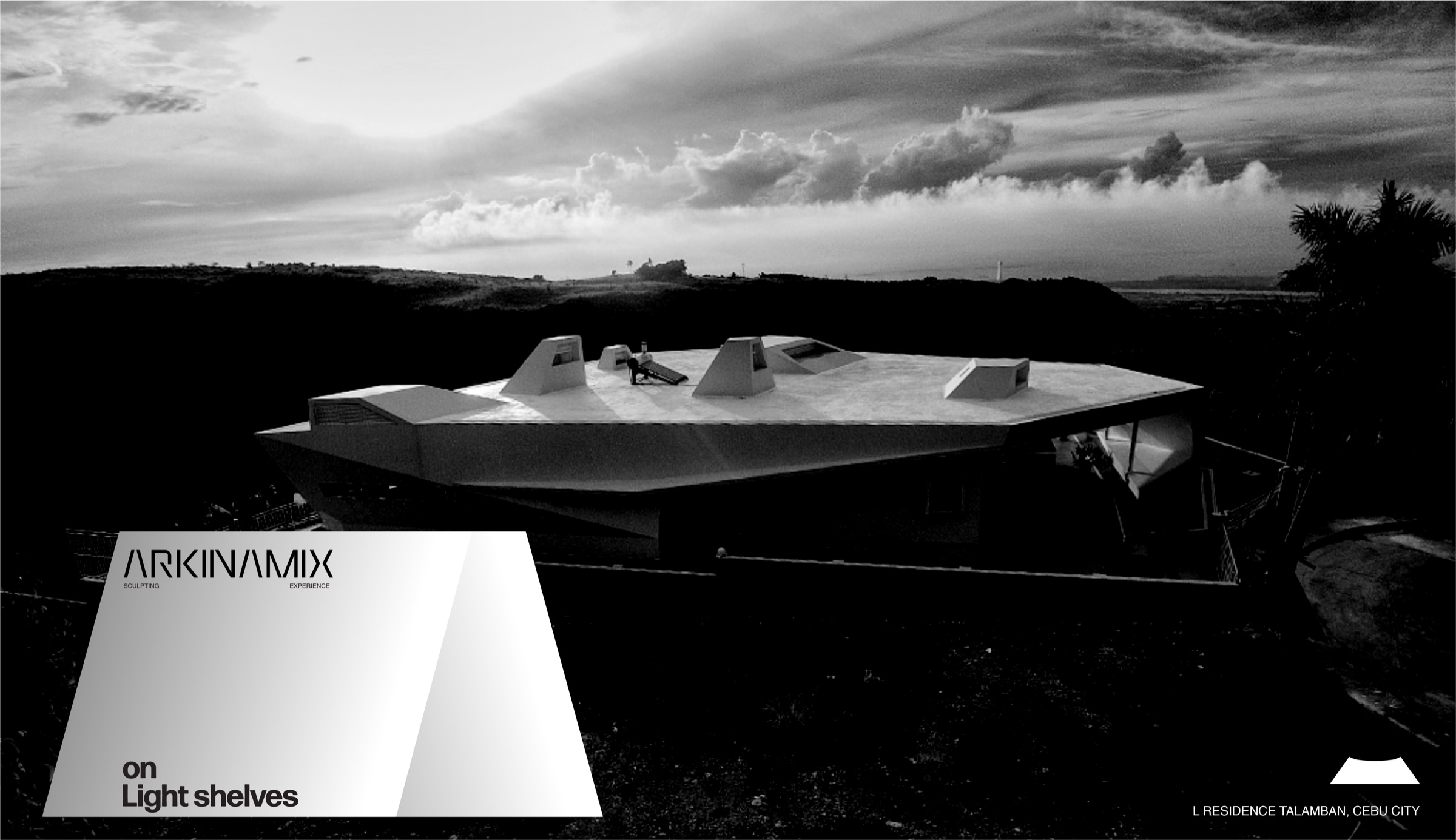
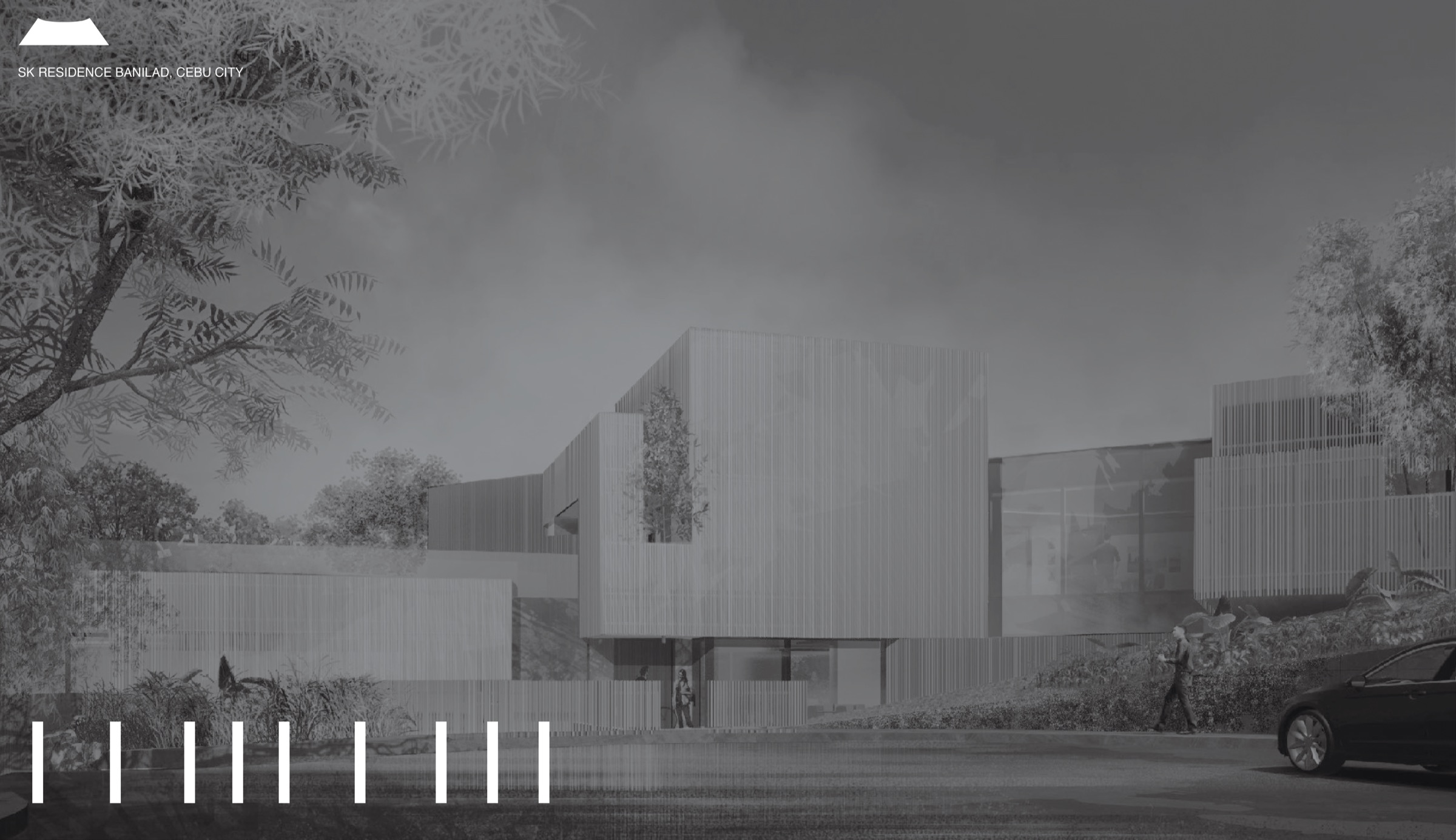
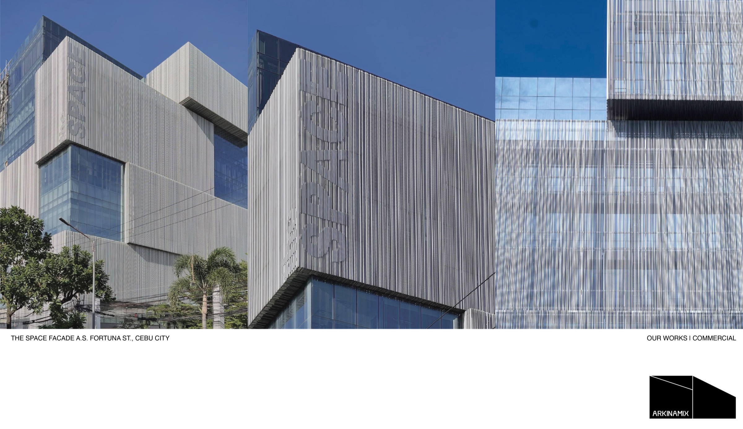
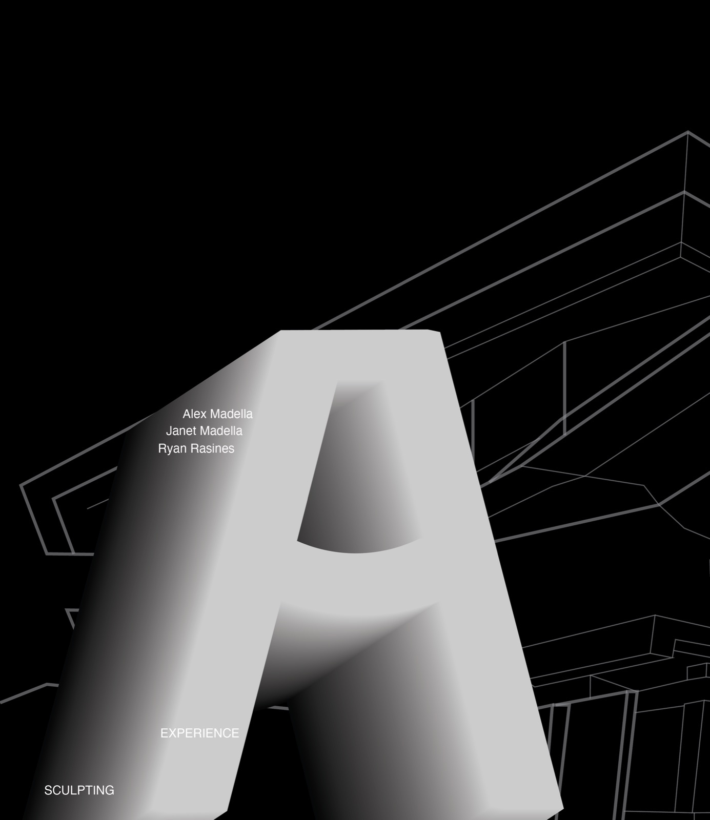
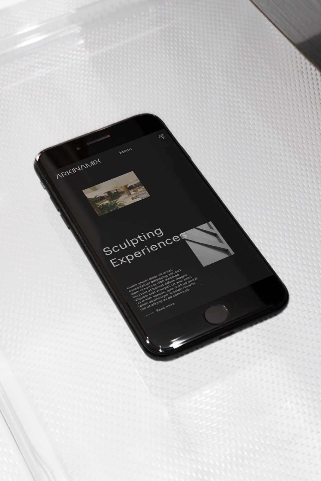
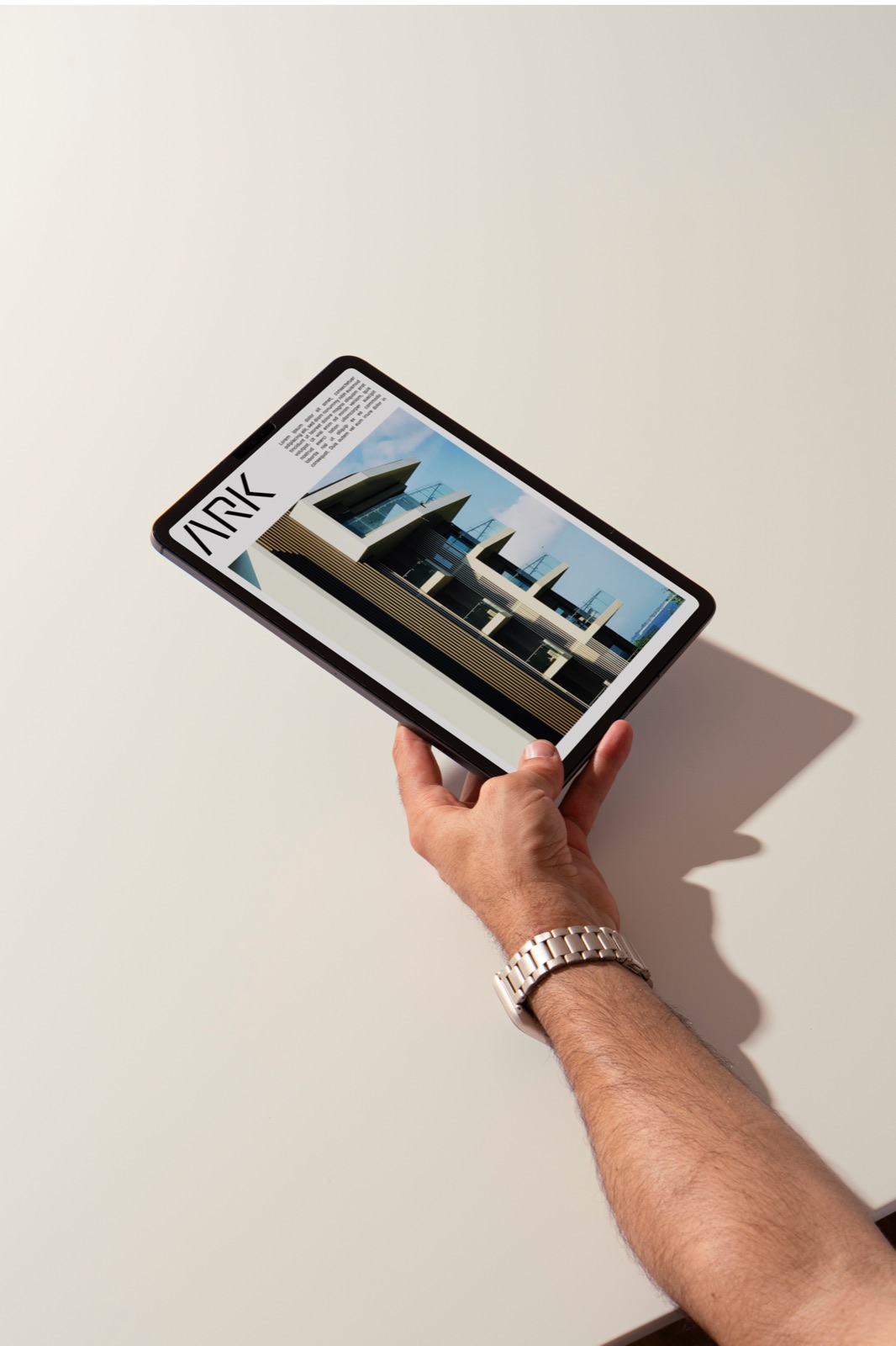
The Arkinamix visual system is designed to be adaptive, immersive, and deeply integrated with the firm’s architectural explorations. Rather than existing as a static identity, the system provides a flexible framework where thematic, material, and technique-based explorations from Arkinamix’s projects can inform and shape its branding elements.
This approach ensures that the brand mark, typography, and graphic treatments become an extension of the firm’s design philosophy, allowing the identity to evolve alongside its architectural innovations.
Color and Typography
Display Forma DJR Display Bold
A B C D E F G H I J K L M N O P Q R S T U V W X Y Z 1 2 3 4 5 6 7 8 9 0 ! @ # $ % ^ & * ( ) _ +
Text Helvetica
Thank
You